
-
Free Fonts: Free Is Not Always Free
Like I explained in the introductory post An Introduction to Free
-
When Johno first asked me to write about Typekit, I jumped at the

-
VAT MOSS: the facts-updated with new info from the UK government
Updated 6 January 2015With the new year upon us and the confusing

-
Fontsmith is a leading London-based type design studio founded in

-
ATypI 2010 Dublin: The Word – Presentations
What!? Another post about the my last ATypI review.Next episode,
-
What are Optotypes? Eye Charts in Focus
I started my quest by asking my ophthalmologist, who enthusiastic

-
ScreenFonts: Stoker, Dead Man Down, The Incredible Burt Wonderstone, Tyler Perry's Temptation, Wrong
Don't you hate it when after you've finished something you discov

-
The Rediscovery of Boudewijn Ietswaart
Lettering in the Netherlands has had many great exponents from Ja
-
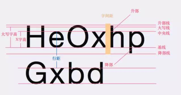
字体&排版学UI的同学都知道,无论做网页还是App设计,文字内容总是能占到整个版面将近80%的区域,所以说,理解字体与排版对UI设计师来说非常关键,你需要始终把内容的可读性放在首位去考虑,从而权衡你对字体与排版的选择。01、字体的基础术语了解字体设计的基础术语非常重要,这些术语在介绍字体设计的相关文章中经常出现。比如 x-height(X字高)指的是从字母的基准线开始往上到最矮字母的顶端的距离,当X字高的比例相对...

-
ScreenFonts: Fun Size, Chasing Mavericks, The Sessions, The American Scream
I suppose American FontFeed readers are recovering from yesterday