
-
Spacing. Some words about spacing type. Much more important than the shapes of the characters, is the rhythm of the type. A typeface with beautiful characters which are badly spaced is extremely hard to read. However, if the shapes of the letters are
-
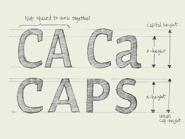
Small caps. You could guess it already from the name, small caps are small capitals. Capitals which have the same height as lowercase characters.你可能看名字就猜出来了,小型大写就是小号的大写字母。和小写字母一样高度的大写字母。Why are small caps
-
A few things I've learned about typeface design
Teaching on a postgraduate course feels very much like a spiral:

-
In an effort to unseat PayPal's dominance in the business of pers

-
The 20 best free cursive fonts
Cursive fonts, or script fonts, are especially prevalent on the w

-
Valentype | Testify and Win The Typeface You Love!
If you know what it's like to passionately love a typeface, here'
-
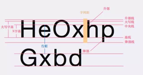
字体&排版学UI的同学都知道,无论做网页还是App设计,文字内容总是能占到整个版面将近80%的区域,所以说,理解字体与排版对UI设计师来说非常关键,你需要始终把内容的可读性放在首位去考虑,从而权衡你对字体与排版的选择。01、字体的基础术语了解字体设计的基础术语非常重要,这些术语在介绍字体设计的相关文章中经常出现。比如 x-height(X字高)指的是从字母的基准线开始往上到最矮字母的顶端的距离,当X字高的比例相对...
-
Call for Participation: 33rd Internationalization & Unicode Conference
Contact:Stephanie Covert OMG +1-843-737 0637 info@unicodeconferen

-
ATypI: All Eyes on Web Fonts (& Other Things)
I'm at ATypI, the type conference being held in Reykjavik right n

-
Britain By Bike "Book Of The Year" At BPIF Book Awards
We've all known for long that the mid-90s mantra Print Is Dead is