
-
To be honest I originally was reluctant to previous instalment of

-
ScreenFonts: A Good Old Fashioned Orgy, Contagion, Drive, Machine Gun Preacher
Phew, we've got a pretty hefty episode this time. The posters of

-
My Type of Music: The Rosebuds, Peter Murphy, Random Axe, Pat Metheny, The Dear Hunter
Before we start this episode of My Type of Music I would like to

-
The success of the Focus On FontStructors mini-interviews – which

-
Focus On FontStructors – Ata Syed (thalamic / minimum)
For the fifth in our series of mini-interviews with FontStructo
-
A few things I've learned about typeface design
Teaching on a postgraduate course feels very much like a spiral:

-
A little over a month ago Tipos Latinos announced the selection f

-
Celebrating 20 Years of FontShop With Jürgen Siebert
Now Chief Marketing Officer of FontShop AG, Jürgen Siebert joined
-
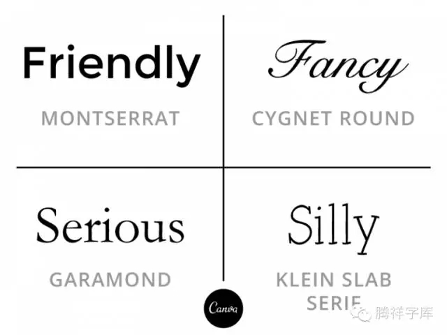
文字排版(Typography)不只是从下拉选单选择字型和点数而已,文字排版是一项流传数世纪的技艺,自木制和金属的活版印刷便开始,而且它不只历史悠久,还很实用,大部分的人只要掌握一些实用的诀窍,就可以将之活用在诸如履历表、电子报或名片等日常设计项目上。资深视觉设计师 Janie Kliever 在 Design School 发表了一篇文章,列出 10 个能帮你增进文字排版的诀窍和密技,虽然介绍的是英文字型,不过还是相当实用,让我们一起...
-
作者/ Author: Ben Archer © 2007 (text and images)原载于/Original from: