
-
Readability. The only important aspect of a text typeface is the readability. Many decisions can influence the readability. Which contrast you create, the length of the ascenders and descenders, the rhythm, the blackness of a type, the strength
-
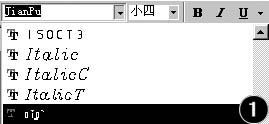
简谱的输入历来是音乐老师头疼的一件事,目前较流行的音乐专业软件(如:音乐大师、飘扬音乐等)多数只能进行五线谱的输入和打印,即便有些软件能进行简谱的输入(如Muse、乐音),但其使用方法繁杂,很难掌握,也不便于排版和处理。日前,笔者无意中在字客网(下载地址
-
Putting Words on Your Photos No Longer Looks Awful With New App
Most text-over-photo apps turn pictures into things that look lik

-
Album Packages For The Black Keys And The White Stripes Win Grammy Awards
Past Sunday February 13, My Type of Music-loving readers.In the l

-
永远都在寻觅字体设计的灵感。夏天过后,我买了一套便宜的书法钢笔,说服自己,它会让我的鸡爬字产生脱胎换骨的变化。在浪费了一个星期和几
-
字形: glyph、字型: font、字体: typeface,三者有着本质的区别,具体概念可以自己上维基查,这里我随意聊聊站酷内相关的现象
-
在一般的文书排版软件上,所谓的行距,通常指的是上一行的字的 baseline 至下一行的字的 baseline 的距离。而这种定义下的行距,也通常是由办公排版系统本身自行在控制、调整的。但是在 TrueType 字体规格中亦有所谓的 linegap 的信息,有些应用软件会使用他来当做是

-
European Design Awards 2010 "Original Typeface" Category Winners
Last Sunday several type designs were honoured at the European De

-
Trailer For Heroine, A New Typeface From Fountain
Type designers and foundries sometimes go to great lengths to hav

-
(Click any image to enlarge.)It's no secret I'm a devotee of the