
Launched in August 2012, Medium is a new publishing platform conceived by Ev Williams and Biz Stone, the minds behind Twitter and Blogger. With their most recent venture, they aim…
to rethink how online publishing works and build a system optimized for quality, rather than popularity. Where anyone can have a voice but where one has to earn the right to your attention. A system where people work together to make a difference, rather than merely compete for validation and recognition. A world where thought and craftsmanship is rewarded more than knee-jerk reactions. — medium.com/about
As if the spirit of collaboration was also guiding the selection of fonts, Medium uses two typefaces that don't have a single creator, but emerged from teamwork:Myriad(Carol Twombly and Robert Slimbach with Fred Brady and Christopher Slye).

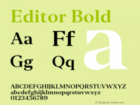
Meta Serif is used as the main typeface, at carefully determined sizes and line-lengths, with headings in the distinct Bold. It is wonderful to see how mature webfont typography is already, and how self-evident and almost incidental it can look.
It stands to reason that her older sister Meta is the best sans-serif to pair Meta Serif with. And while superfamilies come in handy for complex editorial design tasks, these all-round carefree packages are rarely applied as intended. Many typographers feel that such serif/sans siblings harmonize all too well. They rather take up the challenge of putting together a good team themselves, with a little more friction between the players.


Myriad is a dynamic sans with open letterforms made in the early 1990s, just like FF Meta. It does without the idiosyncrasies in the details, though: no angled entry and exit strokes, and more conventional shapes for 'g' or 'y'. This toned-down choice was a good one for the way the sans is deployed on Medium: smallish text for buttons, navigational items and meta information in headers, often in all-caps.
In larger settings, e.g. on user profiles, category indices or the 404 page, a bolder weight of Myriad sets itself apart from the (photo)graphic backgrounds. In the very large sizes, it is tracked negatively for more impact, by 0.05em. That equals 50 thousandth of the point size, but, in many browsers, looks like 40, due to rounding.

The designers also looked into other typefaces, before settling on Meta Serif and Myriad. The shortlist included Freight Sans, FF Tisa, Adelle, and URW's Franklin Gothic. At least this is what is revealed by peeking into the stylesheet, where these unused fonts still are referenced.
The makers of Medium are aware that long passages of all-caps text are inadvisable, and they can very much tell the difference between straight quotes and curly ones. On the Terms of Services page however, they had to surrender to the lawyers' specifications — but not without taking a dig at judiciary and its twisted ideas of readability. I love it.


