Source: http://www.behance.net.License: All Rights Reserved.
Red Antler:
We created branding and design for this new fast casual restaurant that offers a fresh take on authentic Greek cuisine. Classic patterns like you'd find on a Greek diner coffee cup, take an unexpected twist. In addition to brand identity, we designed the interior space, food packaging, and a responsive website that succeeds in making us very hungry.
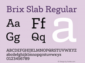
The 'g' from Brix Slab is modified in a subtle reference to a typical Greek pattern. Not sure it's the cleanest modification (needs work on the curves), but it's a nice idea. Avenir is used for the sans.
Found via Design Work Life.

Source: http://www.behance.net.License: All Rights Reserved.

Source: http://www.behance.net.License: All Rights Reserved.

Source: http://www.behance.net.License: All Rights Reserved.

Source: http://www.behance.net.License: All Rights Reserved.

Source: http://www.behance.net.License: All Rights Reserved.