Earlier this week a brand new website entirely dedicated to a single typeface family went live. Erik van Blokland's FF Trixie OT – a major upgrade of the seminal rough typewriter typeface – can be accessed on trixiefont.com. After metaserif.com this is the second microsite published by FontShop San Francisco. I used the occasion to interview Erik van Blokland.
The microsite features five sections.
The Story of FF Trixie recounts the origin of the design and explains how it was upgraded to the new version.Technical Specification includes all you need to know about the technical specifications: OpenType Layout Features, Packages, Language Support.In-Use Gallery allows you to submit your designs created with FF Trixie or pictures of FF Trixie spotted in the wild.Specimen showcases the different versions and grades of FF Trixie.In Free Downloads you'll find a wallpaper and poster, FF Trixie specimen PDFs, a feature overview, and a "Top Secret" Russian Document Specimen by Ilya Ruderman.
Furthermore a cool little trailer produced by Erik with music by Just van Rossum can be found on the FF Trixie home page. It is also hosted on YouTube and Vimeo.
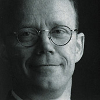
FF Trixie OT portrait of Erik van Blokland generated with Image to HTML/ASCII
Source image:Marc Eckardt
I'm always interested to find out why type designers revisit one of their creations, so I decided to conduct a little interview over e-mail with Erik van Blokland. The first question was self-evident:
What made you decide to revisit Trixie?
A new OpenType version made sense, and I had an extensive list of desiderata – first and foremost the expansion of the supported languages: a larger character set, integrating the Cyrillic version, and adding the Greek characters.
The original version of Trixie was a compromise between detail and technique. Back then printers and computers had cute little memories, and Trixie was skimming their limits. But now those problems are a thing of the past. Furthermore there was something about the characters themselves. I saw a number of applications where the letters were used really big, some of them in the movies. The coarseness, the fact that you clearly noticed those long straight lines that render the roughness started to irritate me. More detailing was required, and designers should have more options when using Trixie.
How exactly did you produce the enhanced Rough version and the new Trixie HD?
A system for FontLab Studio, written in Python and RoboFab. It was the only way to achieve the right amount of detailing. Not only size and positioning of the details were important, the "budget" was also limited to 3000 Bézier node points per glyph that needed to be allocated optimally. The rendering of the fonts eventually took up the most time because the code and the parameters needed tweaking for every font.
Basically the Rough version is the same as the original Trixie, but with a layer of moss growing on the letter forms. This means the new version can be neatly integrated in existing designs without causing text to reflow. But with the advantage of having more detail, and of course an extended character set that'll take you a lot further.
The High-Definition version needed more work. Compared to the Rough the HD version also adds detailing within the character shapes. The characters are composed of countless spots creating that greasy, gritty effect. On screen those spots produce realistic grey tints (actually it is a kind of halftone). But when used in large sizes it looks like the impression of a typewriter ribbon. A genuine impression of a typewriter has no blacks nor whites, but exists of grey smears on the paper. Although this is not possible with fonts, not even with OpenType, the halftone method of Trixie HD mimics this effect convincingly.
Because the character shapes were generated automatically it was possible to create several alternates per glyph. The HD fonts each have seven versions for every character, some lighter and some darker. OpenType features then produce a pleasing random mix.
I was discussing FF Trixie HD with Kris Sowersby over iChat – "17 million points!? F**********!" – and he wanted to know how many times FontLab died on you during the process. :)
The rendering was actually very stable. The texture engines stayed away from FontLab's rough spots and rendered for days. Rather than importing a huge number of points from an external source – for instance Illustrator – FontLab generated the shapes. So it was possible to stop before things went wrong. The 17 million is the total in all weights and versions. I think the maximum for a single source is 6.5 million. :)
When interviewing Erik Spiekermann it soon became clear that the design and production of FF Meta Serif was a collaborative effort. Did you too work together with other type designers/technicians on the new FF Trixie? 10,824 is an insane amount of glyphs after all.
The number of glyphs sounds more impressive than it is. The extended Latin, Greek and Cyrillic do add up, but it's the seven iterations of each glyph in the HD series that really adds to the total. Generating those alternates was mostly automated.
Christoph Koeberlin at FontShop International did a serious amount of testing and checking. The detail makes the fonts rather large, and we had to make sure they would reasonably behave in various applications and on different platforms.
Forgive me this fanboy moment, but together with Just van Rossum – under the guise of LetTerror – you are responsible for a number of innovations and original concepts in PostScript type, like RandomFonts, truly hand written script, BitPull, realistic instant types and typewriter fonts, etc. A whole slew of followers/imitators walked in your footsteps. How does it feel to "reclaim the crown" with the ultimate typewriter font? After all you've considerably raised the bar.
You're being silly. Mind you, I'm always pleased to see Trixie in use, and I thought it would be nice to offer more choice in texture and an extended character set.
The thing about typewriter fonts and handwriting is that it seems to be an easy way into type design. Find an old machine, type some letters, a bit of Photoshop and FontLab, and you're done. It's easy to make such a font, but they're really difficult to do well. If you look through the dirty typewriter fonts online there aren't that many remarkable ones. The problem with typewriters is that the actual imprint in the paper is not a black and white shape. It's a grey smudge and some deformation of the paper. Fonts can only be black and white, so you have to draw a line somewhere. But if you autotrace these smudges they become totally arbitrary shapes which do not work as a typeface.
I learned as much when I drew the original Trixie; the editing and balancing of the texture took most of the time. But I'm glad I did it because I think that the texture is one of the reasons folks preferred it. It just looked more authentic. Still the collective expectation regarding resolution and detail changed as computing power increased. Even the original Trixie shapes began to look dated. By bumping up the points it was possible to top off the detail.
Initially I generated over 6000 points per glyph. That was too much. None of the tools could generate binaries, it was too slow. But because the texture is synthesized and parametrically controlled, it was possible to budget the point counts, and still maintain the detail. It's a subtle process of adding structures and removing unnecessary bits, and a lot of tweaking. Some of the final font sizes seem quite unsettling, which is why we tested the fonts extensively in most applications and platforms. It is a lot of data, but the machines can handle it. And if you need to take it down one notch, you can always use the Light and Heavy weights, the originals.
Like the original, the new Trixie fonts can be used in a broad range of design. Branding, packaging, print, broadcast. But Trixie is also used in all sorts of contexts and styles, from silly to profound, historic and hip. The new language support will make it an interesting choice for big branding exercises. The new textures will make it easier to find a Trixie that fits the job.