The Aachen typeface dates back to the late 1960s when Colin Brignall designed it for Letraset dry transfer lettering sheets. Named after the German city where many believe Gutenberg first used moveable type, Aachen's bold weight and short, slab serifs made it a natural choice for display typography. A lighter (medium) complement was drawn in the late 1970s but the bold design continued to be the most popular design. Aachen was made available as phototype fonts in the 1970s and digital fonts in the early 1990s – but the family retained its diminutive size.
Realizing that more weights would dramatically increase Aachen's range of use, Jim Wasco – a senior type designer at Monotype Imaging – put together a proposal that would bring the family into the 21st century.
"I was amazed at how much I saw the old Aachen Bold being used and I thought that a larger family would be welcomed by graphic designers," says Wasco. "I hope my redesign and enlargement of the original family make it more versatile – and will satisfy the desire designers seem to have for more Aachen."

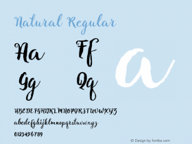
The happy result of Wasco's proposal is Neue Aachen, a family of 9 weights, from ultra light to black, each with an italic complement – for a total of 18 styles. Neue Aachen is also available as a suite of OpenType Pro fonts, allowing for the automatic insertion of ligatures, fractions – and a special alternate g that Wasco felt added a distinctive quality to the design. Pro fonts also include an extended character set supporting most Central European and many Eastern European languages.
When asked about how his design improved the versatility of Neue Aachen, Wasco replied, "The family can now be put to work at any size from small text to large display applications. The bold weights can be excellent choices for headlines, banners and ads. The book and regular were drawn for text setting, and the extra light and ultra black weights add extra oomph – or a touch of finesse – to large display copy."
Wasco's revitalization of Neue Aachen takes a 40-year-old design – with a heritage that dates back to the first fonts of movable type – fully into the 21st century.
The complete Neue Aachen family is available as desktop fonts from the Fonts.com, Linotype.com and ITCFonts.com websites. It is also available as dynamically downloadable Web fonts.
Click here to learn more about – and license – the Neue Aachen family.

Allan Haley is Director of Words & Letters at Monotype Imaging. Here he is responsible for strategic planning and creative implementation of just about everything related to typeface designs.