I am a bit on the fence about nostalgic looking music videos – and any form of vintage design by extension. On the one hand our fascination with "authenticity" and referencing specific periods in design history may at times be holding us back from truly advancing the field of design and typography. Yet on the other hand when they are well done these clips can be very charming and loads of fun. I have discussed a couple of such videos in the past. For example Reid Miles is well-represented on The FontFeed with two videos included at the end of the popular post Almost Blue — Album Covers Inspired By Blue Note Records – Helicopter Girl's Angel City and Gabin's Into My Soul – and the promotional video for the Bellavista Social Pub. I also discussed Caro Emerald's That Man, a video based on classic movie titles and posters from the 50s and 60s, a tribute to the œuvre of legendary designer Saul Bass. This time we look at some videos for Ben l'Oncle Soul.

The music of French singer and songwriter Ben L'oncle Soul is indebted to classic Motown soul. Both his record sleeves his videos try to recreate that specific atmosphere in images and type. The cover for his eponymous debut album released by Motown Records in 2010 looks suitably worn, as if the record had been recovered at a flea market or from a dusty attic. Both typefaces appear authentic, yet only one truly is vintage. While Franklin Gothic fits the bill, Bureau Grot is a contemporary family based on original specimens of the grotesques released by Stephenson Blake in Sheffield.

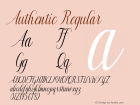
More Bureau Grot on the cover for the single Soul Wash, whose title is set in Murray Hill, Emil Klump's fine brush script from 1956.

On Live Paris the magnificent compact-sans-with-a-twist TC Europa Bold is coupled with Windsor.
Ben l'Oncle Soul's graphic style is sustained in his music videos.
Ben l'Oncle Soul Soulman (Official Music Video) from // Videodrome on Vimeo.
Written and directed by Nassim Maoui and Christophe Mentz, two French directors and scriptwriters who operate under the name of Videodrome, the music video for Soul Man inventively integrates design and typography in the footage to visualise the lyrics. With graphic design by Stephane Lamalle and Florian Fusy, it uses a mix of typefaces both old and new, amongst others a selection of compact sans serifs, Rockwell Extra Bold, Doobie, Bodoni, House Of Terror, and a prominent role for Proxima Nova and the sports-inspired Metroscript.
Ben l'Oncle Soul Soulman English Version (Official Music Video) from // Videodrome on Vimeo.
Because one line in the lyrics of the English version of the video didn't match the original French version, one shot was remade to look like the opening titles sequence for Alfred Hitchcock's North By Northwest.
Ben l'Oncle Soul – Little Sister (Official Music Video) from SoLab on Vimeo.
Type is used in quite a different way in the clip for his other single Little Sister. Cut-out cardboard and painted letters function as comic book sound effects. Again Proxima Nova functions as primary sans serif.
Ben l'Oncle Soul Seven Nation Army (Official Music Video) from yamoy on Vimeo.
Ben l'Oncle Soul's very first video was for the White Stripes cover Seven Nation Army. The stop motion piece was entirely made by hand by motion and graphic design studio Yamoy, the collaboration between l'École Nationale supérieure des Arts décoratifs de Paris graduates Benjamin Raimbault et Vincent Défossé. With more than three million views on the internet, the video became very successful. Bureau Grot does a brief cameo on the box of laundry detergent, and the logo of the washing machine looks suitably retro with its Connected Chrome Script.
Ben l'Oncle Soul Soul Airlines (Commercial) from DavidWeiszfeld on Vimeo.
We end with a lovely tongue-in-cheek commercial for the artist.