
Source: http://designarchives.aiga.org.AIGA Design Archives. License: All Rights Reserved.
"My friend David Godine and I conceived this book as a very small format hardcover in the manner of Jean de Tournes, the 16th-century French master. Later, when we realized that the greatest potential audience for the book would be college students, we dropped the conceit and decided to publish it as a paperback (only) in standard format. I decided we ought to go out in style and make this edition an especially elegant one, classical and generous in its proportions, printed inside and out on especially nice textured papers.
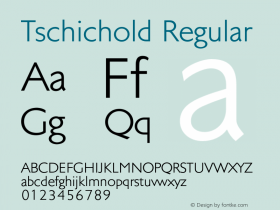
I made my first text typeface especially for this great classic (which was first planned six years before it went into production), though it appeared in a number of titles published before this one. It is called Montaigne Sabon, inspired in part by some drawings for a never-realized foundry version of Jan Tschichold's famous Sabon types. The result is a very restrained design of generous proportions intended for long-haul reading at 11–12 point size." — Scott-Martin Kosofsky

Source: http://designarchives.aiga.org.AIGA Design Archives. License: All Rights Reserved.


