Form, Issue 1

Satura Parts and Berling Nova Sans Bold
Form magazine is the result of a merger between the two titles Form, a Swedish magazine focused on design (everything from industrial design to handicrafts), and Forum, a Nordic magazine focused on public environments (architecture, interiors, and furniture). The new Form will be published six times a year in two editions — one Swedish and one English. Art directed by Cecilia Lindgren, the plan is to use Nordic typefaces in keeping with the magazine's focus on regional design:
The magazine has a very rich visual history so I started off my research by going through the extensive archives. In the 1960s, Karl-Erik Forsberg was the art director and is considered one of Sweden's most masterful graphic designers. He created the first Swedish serif, called Berling in 1951 and it was used in Form magazine in the 1960s. This typeface is seen as possibly the most definitive Swedish typeface.

Form uses Berling Nova Text (above) for most body copy and the delicate Display version (below) for large introductory type.

Berling was available in digital form for many years (Adobe, Elsner+Flake, Scangraphic, URW), but all of these were typically feeble interpretations of a single metal size. Fredrik Andersson and Örjan Nordling revisited the original design in 2004 and developedBerling Novawith separate cuts for Display and Text. This means you can get all the elegant details at large sizes, but a sturdier, darker, more readable face for text.

Form, Issue 1: Table of Contents using Berling Nova Sans


Departments and short articles are set in Berling Nova Sans.
Berling Nova didn't get much fanfare on its release and has consequently been buried in Linotype's library for the last seven years. Even more unknown is the lovely companion,Berling Nova Sans, that Nordling and Andersson created in 2007. It follows the concept of a "serifless book Roman" in the manner of ITC Legacy Sans, FF Scala Sans, and Today Sans. The entire Berling Nova family is used throughout Form and the logo is based on the sans.
Main headlines and pull quotes in the feature section are set with a "guest" typeface which changes for each issue and is introduced in a short news story on the contributors page. Lindgren will pull from a growing crop of new Nordic designers for each guest typeface:
The idea fulfills two of the objectives of the magazine: 1. The focus on the Nordic countries and 2. An aim to cover every aspect of "form", including graphic design.

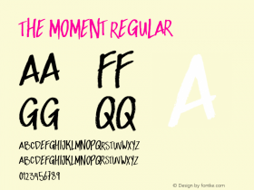
The magazine launched in February 2011 using the brand newSaturaby Peter Bruhn and Göran Söderström. Released under Bruhn's Fountain label, Satura is an unusual "suite" of styles, ranging from a monolinear Humanist sans to a showy stencil with peculiar stroke contrast. Lindgren knew it was the right typeface the moment she saw it: "It needed to be something that stands out, so that the reader picks up on the idea of the guest typeface."


Satura Parts and Satura in Form, Issue 1
The second issue, just released, usesCalypso I, from Finnish foundry Typolar. Issue 3, which is going to print next week, features a new typeface by the Icelandic type designer Gunnar Vilhjálmsson calledCopper Stencil, which will be released in Fall 2011.
Thanks to Göran Söderström for providing photographs of the magazine.
Update:Cecilia Lindgren invites readers to suggest or submit Nordic typefaces for future issues. Comment here or contact her.