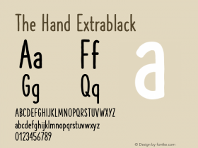

For the upcoming Schocken/Pantheon Kafka library, cover designer Peter Mendelsund turned to a typeface derived from the handwriting of Franz Kafka himself.FF Mister Kis not a facsimile of Kafka's pen, but Julia Sysmäläinen studied the writer's manuscripts closely to develop a font family that could be readable and useful in modern design. The result is a script with a sense of timelessness, a rare trait among handwriting faces — most are either antique or contemporary.

The FF Mister K family has three members: Standard, Crossout, and Onstage, a more decorative alternative.

Mendelsund uses the fonts well. My only suggestion would be to substitute an alternate 'k' on this title to avoid any ambiguity between "America" and "Amerika".
The fonts have the requisite ligatures and alternates to prevent a mechanical appearance. There is even a "Crossout" font for emulating handmade mistakes and corrections.
The choice ofTimesfor the author name is not as straightforward. It's based on Mendelsund's personal view on Kafka and how he sees the writer connecting to Times' modern day image:
My associations with Times are two-fold, and contradictory. On the one hand, Times puts me in mind of Microsoft, MS Windows, Word (with which Times is distributed and is most people's intro to the font), which in turn makes me think of nefarious organizations and the powerlessness of the individual in the face of the large, uncaring, politico-corporate entity. On the other hand, as the universal default face, it has an everyman-like humility to it. Kafka, I think, would approve.
On the smallish "F. Kafka", Mendelsund adds:
There are authors who cry out for a big treatment for their name, Like, you know, TOLSTOY, or NIETZSCHE. Or even some that want prettifying, like a Proust, say. But Kafka, he seems, weirdly, best treated with as little grandiosity as possible.
And the eyes?
… not the first or last time I will use an eye as a device on a jacket — book covers are, after all, faces, both literally and figuratively, of the books they wrap. I find eyes, taken in the singular, create intimacy, and in the plural instill paranoia. This seemed a good combo for Kafka, who is so very adept at the portrayal of the individual, as well as the portrayal of the persecution of the individual.


By the way, any book lover will love Mendelsund's portfolio site. The breadth of his work is represented by each book spine, sitting on the page like a bookshelf. It's impressive way to show how much he's done, worthy of a desktop background or printed poster.

Mendelsund's book design work. So wide I had to split it into two "shelves".