Type reversed out of photography isn't a new concept, or particularly inventive, but if the photography is good and the type is right it's pretty damn effective. Need Supply Co. proved this over the last year with their email campaigns using fonts from YouWorkForThem. The two companies announced their collaboration at the end of 2009 and it seems beneficial to both parties. As the images propagate to design blogs and social shopping sites they cement Need Supply as a hip, modern retailer while gently promoting YWFT typefaces.
The new look began withITC Avant Garde Gothic.


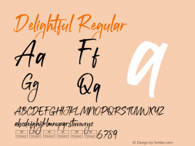
This typeface requires subtitles. Intentionally over the top, Stefan Kjartansson's Cumulus and Foam serves as illustration more than type.
After a few weeks it was obvious that the single-weight Press Gothic dominated the images. The designers switched to a lighterTrump Gothicwhich lets the clothing be the focus. They keep Press around for whenever an extra punch is needed.
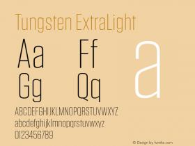
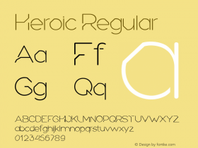
Those in the market for a strong, compact, minimal sans with more weights should also check out Tungsten, Heroic Condensed, Breuer Condensed, Titling Gothic, MVB Solano Gothic, Block Gothic Monopol, and Univers Next Compressed (I prefer the straight sides of the original Univers Ultra Condensed, but the revision adds two more weights).
Once in a while, Need Supply lets loose with wacky type, such as the delightfully uglyCumulus & Foamthat advertises their latest sale.