Through Eye magazine's Noted #13 I discovered the wonderful 100 Alphabets Publicitaires, a Flickr set of a book of French advertising alphabets from 1946. It belongs to the many visual resources posted by Agence Eureka, a blog dedicated to French printed material from the '20s to the '70s. It provides a wealth of visual inspiration with source material ranging from illustrated children's books to vintage costume patterns to old advertisements and board games. The ephemera collected by Agence Eureka is very diverse, with amazing finds culled through old book stores. Personally I am of course most intrigued by the wonderful type specimens in their collection.
The Belgian specimen book 100 Alphabets Publicitaires from Éditions Caboni Bruxelles is a compendium with 100 lettering style examples for commercial artists and letterers. Almost all advertisements right after WWII were still lettered by hand, and these proto-graphic designers used examples of fashionable lettering styles for inspiration. The offering (and quality) in this specific booklet varies greatly, from plain lowercase-only neo-grotesques to intricately ornated display faces and exuberant scripts. Some alphabets lack the proper optical correction, while others seem "inspired" by existing typefaces. However what they do have in common is that they all look undeniably charming to a contemporary audience.

For similar styles in digital type see my comprehensive FontList of Three-Dimensional Type.
Particularly interesting is the introduction that precedes the alphabet specimens. It explains in French, Dutch, and a delicious Frenglish how letter shapes subconsciously influence the way we perceive words written in them. Then it proceeds to enumerate all the lettering styles included in the manual, detailing how the specific alphabet styles will flavour the advertising message. An excerpt:
Letters have their own language, which cannot be ignored in advertising. To each letter shape is attached a determined psychological reflex, i.e. the structure of the letters provoke various reactions, which can be favourably or not, predispose the readers of the passers-by, towards the advertising message which confronts them.
The characters chosen must of necessity correspond as closely as possible to the kind of publicity being employed. For this reason we think it of use to give explanations of the alphabets reproduced in these pages and some advice upon their employment.

For similar styles in digital type see the Bluemlein Collection from Sudtipos.
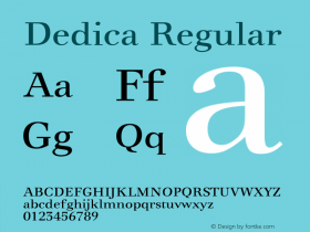
Like I mentioned before, some lettering styles look quite familiar. Either they may have been based on existing typefaces, or contemporary designs were inspired by similar styles. I am compiling an non-exhaustive list with digital equivalents. The title page is set in Nobel Condensed, Copperplate Gothic, while the introductions and captions are all set in William Addison Dwiggins' wonderful Metro (also available with italics as Geometric 415). The list below will grow over the coming days.
Elongated Antique | Industria, MekanikFancy Antique | BifurHeavy Egyptian | Stymie, MemphisSquare Egyptians | Yearbook, TeknikItalian | PL Barnum BlockNorman | Extra Bold High-Contrast Serif FacesElongated Norman | Skyline Serif FacesStencilled | Futura Black