Volume Ten of U&lc was very important to me. Volume Ten Number One announced the results of the first typeface project I worked on for ITC, and Volume Ten Number Three was the first time an article with my byline appeared in the publication.
The story behind the ITC Berkeley Oldstyle™ typeface began in 1977, almost seven years before it was announced in Volume Ten of U&lc. It began at a company called Compugraphic, a manufacturer of phototypesetting equipment.
At one point the Compugraphic type library had more typefaces by Frederick Goudy than any other type supplier. Why so many? Because I liked Goudy's designs, and my job at Compugraphic in the late 1970s allowed me to have a certain amount of control over what faces were added to its type library. Truth is, I had total control; but if other, more senior, managers realized this, my power would have been severely curtailed. So I had to be careful in how I "suggested" which faces to be developed.
A Goudy Favorite
The University of California Old Style typeface, the basis for ITC Berkeley Oldstyle, was one of Goudy's favorite designs. In 1937, a friend asked Fred Goudy if he would consider drawing a face for the exclusive use of the University of California Press at Berkeley. Goudy accepted the task gladly and produced the foundation for the new type family a little over a year later.
I had admired the University of California Old Style design for many years, and made it part of my personal "Goudy Design Program." As much as I liked the design, however, it was not to be first on my priority list. It was too obscure, and I was concerned that pushing it too soon would call attention to the design, and jeopardize, my grand plan. So Goudy's favorite was relegated to somewhere around sixth on my list. When it moved closer to the top, I began to gather specimens to be used as the basis for the revival process, had enlargements made from the metal type specimens, and began preliminary discussion with a designer to work on the project.
But then something happened. Aaron Burns offered me a job at ITC: an opportunity that wasn't turned down. Knowing that I was not going to be able to start, let alone finish, the University of California design project, I filed the specimen material, the photo-enlargements, and the design notes I had made, in a large manila envelope and stored it in my attic.
Berkeley Hibernates
It sat there for a couple of years. My early responsibilities at ITC provided no opportunities contribute to the company's typeface release plans. It took some time to establish the credibility required to suggest a new design. I may have been the "senior type person" at my former employer, but that only translated to "the kid from Compugraphic" at ITC.
Finally, I got my chance when a type designer notified ITC that he would be late in delivering artwork, producing an opening in the release schedule. There was, however, just enough time for an accomplished designer to create a revival typeface design. I felt like the second-string high school quarterback who, after spending much of the season on the bench, sees the first-string hero sustain an injury in the big game. The phrase "put me in coach" kept coming to mind as I tried to convince Aaron Burns that my idea for the revival of The University of California Old Style was worthy of an ITC release.
My Big Chance
Burns finally capitulated and called Tony Stan to asked him if he would be willing to work on a project with me as the design director. Stan, in addition to being a world-class type designer and someone who knew a great design project when he saw it, was also a kind, gentle man who would have no trouble working with someone of half his age and possessing a third of his talent. The collaboration was one of the most rewarding of my life.
The name "Berkeley Old Style" was chosen because the design isn't really a direct copy of the University design, but close enough that we wanted to give credit where it is due.
Additional Releases
ITC also announced two additional new typefaces in Volume Ten: the ITC Weidemann™ family, based on a custom design Kurt Weidemann did for the German Bible Society, and the ITC Usherwood™ family, released posthumously after the death of its designer, Leslie Usherwood.
The First Article
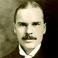
While I had been writing for U&lc for some time, the first article that carried my byline also showed up in Volume Ten. It was about Morris Fuller Benton, and was the first of many biographical sketches in the "Typographic Milestones" series. There is a backstory here too. Maybe I'll write about it in a future post.


Click the PDFs below to find out what else was in U&lc Volume Ten.
Low Resolution:
Volume 10-1 (Low Res).pdf (15.0 MB)
Volume 10-2 (Low Res).pdf (13.6 MB)
Volume 10-3 (Low Res).pdf (14.8 MB)
Volume 10-4 (Low Res).pdf (14.6 MB)
High Resolution:
Volume 10-1.pdf (73.5 MB)
Volume 10-2.pdf (69.1 MB)
Volume 10-3.pdf (69.7 MB)
Volume 10-4.pdf (73.4 MB)

Allan Haley is Director of Words & Letters at Monotype Imaging. Here he is responsible for strategic planning and creative implementation of just about everything related to typeface designs.