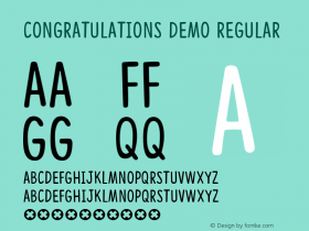
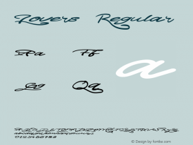
A message on the official Type]Media Twitter account last week saying "Final evaluations are done and we're very happy announce that all our students have successfully passed! Congratulations!", and the subsequent announcement Saturday that the TypeMedia11 website was online has created a minor wildfire this weekend which still is raging through the Twitterverse. Underware advised all type lovers to grab a beer and take an hour off to enjoy the work from this year's Type]Media students, and Nick Sherman proclaimed that the work from the 2011 graduating class is among the most impressive things he's seen all year. Dave Foster, an Australian graphic designer from Sydney with a fetish for letters who will be attending KABK Type]Media Masters in 2012, admitted that it will be a hard act to follow, as this year's class has set the bar and set it high. Yet the www.typemedia2011.com website strengthens Guido Groeneveld's – graphic designer, aspiring type designer and musician – resolve to keep on working hard to be able to enter that great course one day.

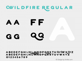
Both the website and the twelve graduates' work received universal acclaim, including praise from high-profile (type) designers and studios like Hoefler & Frere-Jones, Jason Santa Maria, Jo De Baerdemaeker, Folkert Gorter, Frederik Berlaen, Typeradio, Ministry of Type's Aegir Hallmundur, Dan Reynolds, Village, Dalton Maag's Fabio Haag, and so on, with Commercial Type congratulating the graduates for the impressive range of styles on display, a sentiment echoed by Tal Leming. Stephen Coles clarifies "I love the way @typemedia students explore functional but unconventional families (beyond the standard regular, bold, italic)." Fred Smeijers attributes the terrific results to tradition and expert guidance meeting hard work and talent. Some commenters occasionally singled out their favourite typeface/family: Erik Spiekermann declared that his favourite is Cassise, while Ken Barber claimed that Kunihiko Okano's Quintet is blowing his mind. Nice Web Type's Tim Brown had an interesting observation, noting that the Type]Media typefaces feel very balanced – and even more important, their design intentions are meaningful, adding a little later "Nice job with the site, and with the type samples! The word of thanks at the end is a great touch, too." W+K's Bram Pitoyo concurs "What's great about the 2011 #typemedia site other than its new types? The fact that most specimens are SVGs."
Göran Söderström didn't shy controversy, comparing the work with the output from University Of Reading's Department of Typography MA Typeface Design, claiming the Type]Media type designs have more originality. Dunwich Type's James Puckett agreed "Not one Unger font in the entire wonderful batch of new Type & Media fonts," which elicited Söderström to reply "Yes, this is what any design school should aim for, coaching each student to create something personal."

FontFont Marketing Director Ivo Gabrowitsch asked an interesting question: "The impressive work from @typemedia class makes me wonder once more: is the type (consumer) world big enough for all today's great stuff?" Erik van Blokland has faith: "I remember that same question from the ancient early 1990's. You know, it worked out well." His brother Petr is convinced: "Even more so: all today's great stuff does leverage the increase of type (consumer) world size." Dan Reynolds however comments: "Lots of great student typefaces are never sold. More to do with their designers than the market, tho…" Food for thought. What do you think?
All images of the Type]Media 2011 Graduation Exhibition by Martin Weber.