Arjowiggins Creative Papers, has partnered with Jean Francois Porchezpan from Typofonderie to launch five free typefaces to promote the new for the Conqueror range of papers. The typefaces designed by Porchez include AW Conqueror Sans, AW Conqueror Didot, AW Conqueror Inline, AW Conqueror Slab and AW Conqueror Carved.
In addition, a Chinese font is available in partnership with The Beijing Founder Electronics Company. Arjowiggins says that the typefaces provide designers with fresh and innovative ways to get their own unique messages to stand out.

Arjowiggins invited three leading artists – Seb Lester, illustrator; Thomas Brown, photographer; and Tsang Kin-Wah, contemporary artist, to ruminate and create designs that reflect the theme. By using the new typefaces and the latest Conqueror papers the artists have showcased the range by creating a designers' brochure.
The brochure provides a dedicated toolkit to inspire designers. When you turn the page you discover the full alphabet for each typeface, a short brief about each style, and exciting, impactful designs made from different combinations of Conqueror papers, typefaces and printing techniques.

The new typefaces are used in all Conqueror marketing materials – including another brochure targeted at printers, illustrated by designer Damien Weighill.
All the new typefaces are available for free to download from theConquerorwebsite.

Jean Francois Porchez says that the typefaces "reflect the rejuvenation of the Conqueror brand: they are elegant and classic but also innovative and exciting. Each typeface can be harmoniously mixed with any other style in the range, as they each follow the same basic structure. This empowers designers with a great deal of flexibility to create a range of distinctive visual effects. It is easy for more inexperienced designers to work with the typefaces, while accomplished designers will be attracted by the historical typographic references as each font explores and reworks a different period from the typography cannon.
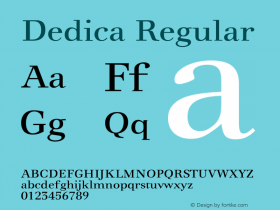
"The new AW Conqueror Sans typeface draws inspiration from European designs between World Wars I and II, whilst evoking the spirits of the Bauhaus and Art Deco periods. Geometric lines and Swashes capitals, more commonly seen in Renaissance italics, have been added to give the typeface creative flair. It is a stylish and smart typeface and gives a metallic aspect to printed materials.
"AW Conqueror Didot is a sophisticated typeface inspired by the 1960s and 1970s interpretations of the Didot dynasty. This new font is an ode to the heyday of dry transfer alphabets and Herb Lubalin, the typographer who mastered the art of setting glyphs as close a possible without overlapping. The result is an elegant typeface that pairs well with Conqueror Laid, a textured paper with fine lines, to create a modern and chic look.
"AW Conqueror Inline pays homage to Nobel inline, a 20thcentury font created by SH de Ross.
"AW Conqueror Slab draws on inspiration from the 1930s geometrical slab typography. AW Conqueror Slab is a modern graphic version of slab typography with a strong design. In the brochure, Thomas Brown pairs the typeface with new Conqueror Wove and Print Excellence technology to really do justice to the vivid colours and bold blacks.
"The AW Conqueror Carved typeface encapsulates the lettering styles that were in fashion during the 19thcentury. The typeface includes variations in depths and relief effects and provides an invitation to play with colour and volume when printing."

In partnership withThe Beijing Founder Electronics Company, Arjowiggins has included a special Chinese typeface in the toolkit. Artist, Tsang-Kin-Wah mixes English and Chinese cultures in his work to create a mix of modern typography and contemporary art.