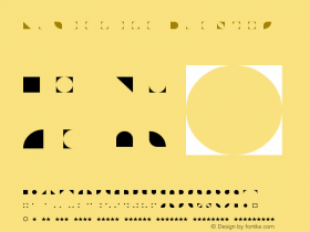
We're always delighted to hear about FontStructions which leave their digital nest to be inscribed on the world of concrete things: FontStructions you can see in the street or on the printed page, FontStructions you can touch … or even taste. Long-time friend of FontStruct Gustavo Ferreira tipped us off to this delicious-looking plate of glyphs.

The Brazilian designer Marcia Martins used FontStruct to help create her design as part of the "Typofreaks – different typography" workshop. Designer and typographer Fabio Lopez* who led the workshop told me more:
… Marcia wanted to produce a small binder with printed letters, and began designing an alphabet with simple geometric shapes to produce rubber and potato stamps. I pointed her to FontStruct to assist in this task. From the alphabet created on the computer she produced the stamps, printed the letters in her sketchbooks and then decided to fry them! …

You can find additional, larger images from this project and the entire Typofreaks workshop on Flickr.
FontStruct in Education
The typofreaks project also illustrates how useful FontStruct can be as a learning tool. I asked Fabio about this:
… FontStruct is a very accessible tool, not just because it's online but by being a quite intuitive creating platform. For students and designers without specific training in type-design, FontStruct offers an interesting approach to the universe of creating digital typography, helping users to understand the complex visual relationships that exist in an alphabet. This exercise also provides a more conscious and precise use of typography, as the user starts to notice details in the structure of letters from their own experiments. For experts it is like an amusement park of possibilities: fast, easy and full of surprises …
More and more educators and students around the world are using FontStruct in their work: Gustavo Ferreira's workshop at HfG Gmünd, Tony de Marco's workshop at Campus Party Brazil, Peter de Roy's use of FontStruct at the Royal Academy of Fine Art in Ghent or the amazing work done at UWE Bristol – to give just a few examples. If you're an educator or a student using FontStruct we'd love to see your work and hear about your experiences. Do get in touch using the FontStruct contact page.
PS: If you're interested in some other wonderful, free typographic resources for Educators and Students please do visit the FontShop education page.
| (*) | Fabio Lopez is a typographer and designer from Brazil. He lectures at various universities in Brazil with a focus on typographic themes and runs the irregular Typofreaks course. In 2007 he caused controversy with his War in Rio project – a version of the "Risk" boardgame dealing with urban violence in Rio de Janeiro. In 2010 he was a member of the jury for Tipos Latinos. |
