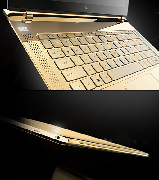
HP Premium laptops will have a premium, shiny, new logo. Well, kind of new. The design was actually submitted five years ago by Moving Brands – one that HP eventually decided against to the disappointment of many.
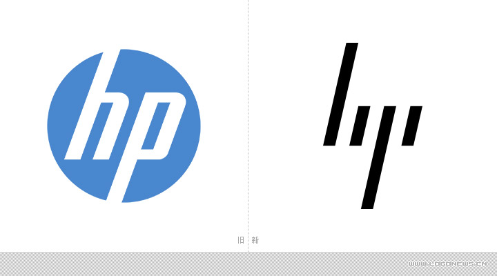
HP’s corporate logo has remained pretty much the same for 75 years straight – blockish letters in a circle – though the current iteration was created in 2010. But its Spectre laptop range is back again to shake things up with Spectre 13, aka the world's thinnest laptop, which is adorned with the much-loved, previously rejected logo by Moving Brands. Non-standard logos are actually almost standard when it comes to Spectre laptops, with last year's Spectre x360 having 'Hewlett-Packard' written out - but HP will extend this sleek new logo across its entire premium laptop range.
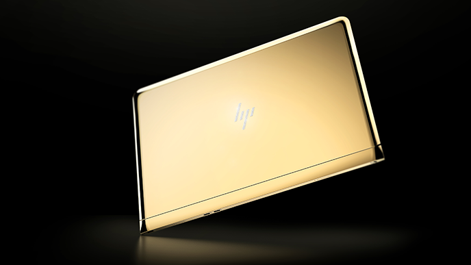
But the logo itself looks good. The branding is clear despite the minimalism of four slanty lines. For HP’s higher-paying premium customers, the logo is a gentle reminder of the more slap-you-round-the-face, main corporate logo.
