Source: http://www.erreacomunicacion.com.Photo: errea comunicacion. License: All Rights Reserved. Artwork by errea comunicacion.
The 2015 redesign (nouvelle formule) of Libération was driven by a vintage spirit, i.e. the idea was to get the original boldness back into the iconic daily paper from Paris. From an article posted earlier on erreacom:
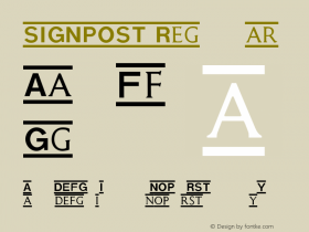
Libération has shaken off its restraints, had no hang-ups about taking a more magazine-like style on board and turned more visually aggressive. In order to do this, its has readopted some of the hallmarks of the original publication: forceful, condensed typefaces, a new ironic iconography, an absolute predominance of red and black, and high-impact resources such as shade and thick borders. All in all, a more vigorous, interrogatory paper. More disquieting. More Libé.
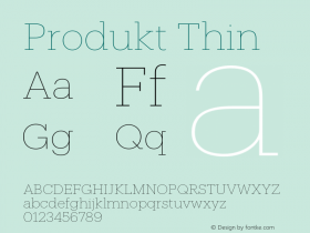
A new extensive type series was commissioned from Production Type. Jean-Baptiste Levée together with Yoann Minet developed Libé Sans, a family that encompasses 5 different widths with identical vertical proportions, "inspired by Antique Presse, a typeface designed in 1964–65 for newspaper and daily press work […] at Deberny & Peignot", with additional influences from Brasilia, Eurostile, and Antique Olive. Libé Sans is accompanied by Libé Typewriter, a proportionally spaced design with a cue from Adrian Frutiger's alphabet for the Centre Georges-Pompidou, CGP (1974). Libé Sans and Libé Typewriter are paired with Tiempos by Kris Sowersby for body text, Produkt by Christian Schwartz in complementary texts, and more nostalgic styles like Graphique Pro and Windsor for signposting.
See Production Type's website for further information on the custom typefaces and more in-use images, and read an interview with Javier Errea about the redesign.

Source: http://www.erreacomunicacion.com.Photo: errea comunicacion. License: All Rights Reserved. Artwork by errea comunicacion.