Source: http://www.filmonpaper.com.License: All Rights Reserved.
Wizards — An epic fantasy of peace and magic.
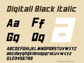
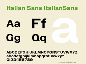
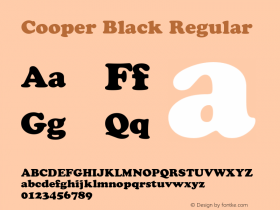
Poster/one-sheet by the legendary fantasy artist William Stout for Ralph Bakshi's 1977 post-apocalyptic fantasy sci-fi animationSintex, a bold funky '70s Italian sans serif designed by Aldo Novarese for VGC, and digitally revived by Canada Type as Stretto. The subtitle is set inGoudy Heavyface, a warm rounded serif similar in style to Cooper Black.
The billing block is set in a mix of Goudy Heavyface, Goudy Oldstyle (possibly a variation of it, like Goudy Series), and Century Oldstyle.
I love this poster. It's kind of a cult film, but this poster is iconic. The type firmly cements this in the '70s. The mix of typefaces is fun and maybe reflective of the different styles of animation used in the film. And while the fonts are quite bold, the simple use of black type of a white background lets the colorful image steal the focus.

Source: http://www.filmonpaper.com.License: All Rights Reserved.

License: All Rights Reserved.

License: All Rights Reserved.

Source: https://www.youtube.com.License: All Rights Reserved.
Titles from the trailer

Source: https://www.youtube.com.License: All Rights Reserved.

Source: https://www.youtube.com.License: All Rights Reserved.
Stills from the opening scene, withMoore Computerin caps and small caps, ironically rendered by hand.

Source: https://www.youtube.com.License: All Rights Reserved.

Source: https://www.youtube.com.License: All Rights Reserved.