There has been a lot of buzz lately about fonts being delivered to your PC desktop that can dramatically improve how text is handled on the Web. Before Web fonts, designers faced a frustrating trade-off: either designing with only a handful of system fonts that reside on most computers, or creating images of copy set with fonts that are not considered "Web safe." Now this is changing, and many typefaces are being made available for Web use. This is made possible through a bit of HTML code known as "@font-face," a W3C compliant method for referencing fonts from servers for use in browsers. This code and a properly licensed font are pretty much all that is needed to put great new fonts in Web pages. With all major desktop browsers now offering @font-face support, the Web is sure to be a typographically more beautiful place.
But what about mobile devices? With more and more of us accessing Web sites from our mobile phones, will we also be able to enjoy the advantages of a full typographic palette for branding, searchability and improved readability on these devices?
I wanted to find out, so (in a completely informal and totally unscientific study) I did. Because of the FlipFont™ app (a little piece of software we developed to enable the standard fonts on some phones to be "flipped" to a suite of alternative designs) we have built an internal competency in testing font software on mobile phones. I asked our QA team to take a look at 14 publicly available Android™ phones from several different manufacturers and put them to the web font test. Ten of the phones passed, delivering the fonts and rendered them to the screen. Pretty cool!
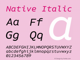
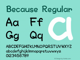
The not-so-cool part is that not all the fonts looked like they do on my desktop. When we began to develop the offering of fonts for FlipFont, we discovered that font data needed a little help in performing optimally and that, in some case, even individual characters had to be modified to display well on small digital screens. We know that some fonts display much better than others in Web pages delivered to desktops. It seems that this is also true for fonts in Web pages delivered to mobile devices.
As much as things have changed in the world of fonts – some things remain constant. Not just any font will get the job done. It takes choosing the right typeface for the project and the best font for the task.

Allan Haley is Director of Words & Letters at Monotype Imaging. Here he is responsible for strategic planning and creative implementation of just about everything related to typeface designs.