Source: http://www.spystudio.co.uk.Spy. License: All Rights Reserved.
Goldsmiths is a world-renowned public research university founded in 1891 and located in south-east London. It provides a diverse programme of study, but specialises in creativity, and covers the arts, design, humanities, and social sciences.
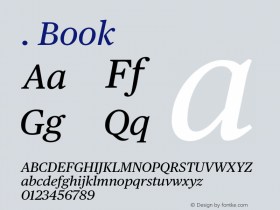
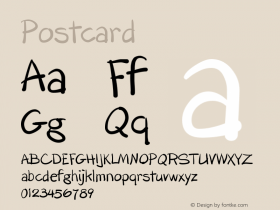
Goldsmiths' heritage, which was reflected in its previous brand identity in a familiar and conventional manner, makes way for a far more current visual expression created by British graphic design studio Spy. This included an unassuming sans-serif logotype, a bold and expressive typographical system based around the font family Druk, a revised tone of voice and bright spot colour alongside those that are described as subdued. This unites a variety of print communication including, but not limited to, posters, postcards and welcome packs.
Read more about this project on BP&O.

Source: http://www.spystudio.co.uk.Spy. License: All Rights Reserved.

Source: http://www.spystudio.co.uk.Spy. License: All Rights Reserved.

Source: http://www.spystudio.co.uk.Spy. License: All Rights Reserved.

Source: http://www.spystudio.co.uk.Spy. License: All Rights Reserved.

Source: http://www.spystudio.co.uk.Spy. License: All Rights Reserved.

Source: http://www.gold.ac.uk.Goldsmiths. License: All Rights Reserved.
The website was redesigned byPublicoandGraphik.

Source: http://www.spystudio.co.uk.Goldsmiths. License: All Rights Reserved.
The logo is based onGothamMedium, with the 'i' dot and the 't' ascender aligned. It has been in use at least since 2010 and predated Spy's repositioning of the brand.