
Source: https://twitter.com.License: All Rights Reserved.
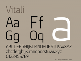
TheDruktype family, mixing and matching its various widths.
As reported on the Creative Review blog:
Pearson has employed all of the available four weights of the typeface across the series covers – the range "makes it ideal for cover-filling exploits such as this," he says. […] "My brief to myself was to fill the cover using all weights of the family – in a way that didn't labour too much on fine detailing. The hope here was that the covers would retain a kind of vitality if I didn't fuss over them too much."

Source: http://www.creativereview.co.uk.License: All Rights Reserved.

Source: http://www.creativereview.co.uk.License: All Rights Reserved.

Source: http://www.creativereview.co.uk.License: All Rights Reserved.

Source: http://www.creativereview.co.uk.License: All Rights Reserved.

Source: http://www.creativereview.co.uk.License: All Rights Reserved.

Source: http://www.creativereview.co.uk.License: All Rights Reserved.

Source: https://twitter.com.License: All Rights Reserved.