Source: http://www.newmetaphorbooks.com.Photo by New Metaphor Books. License: All Rights Reserved.
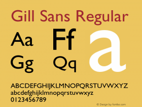
From the newly launchedWestminster, perhaps the first typeface to alphabetize the MICR aesthetic. Its odd letter widths are owed to the fact that it is based on the proportions of Gill Sans. So British.

Source: http://www.newmetaphorbooks.com.Photo by New Metaphor Books. License: All Rights Reserved.
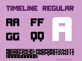
This is one of the funkier timelines I've seen.

Source: http://www.newmetaphorbooks.com.Photo by New Metaphor Books. License: All Rights Reserved.