Our friends at Fonts.com are bringing you a great offering of October's best selling typefaces, just in time for the holidays! You'll feast on 28 style grotesque sans from Latinotype, as well as Choplin--a robust, genial slab serif family from René Bieder in 18 varieties. Plus, we've got our usual bundle of fantastic type discounts: this month you can save big on the expressive "Keepsake script design from Aerotype!

Titular is a condensed Sans Serif typeface that works well with headings, subheadings, newspapers, magazines as well as with logotypes, brands and posters. This typeface revives the spirit of old Woodtypes, but adding a contemporary flavour and Latin American seasoning.
The family comes with 2 subfamilies: one regular and one alternative. Just like many of our faces, every subfamily includes 7 weights plus italics.
Full story : 28 styles by Latinotype

Radikal is a geometric font dedicated to the research of purity. The fonts have extended characters set to support Central, Eastern and Western European languages. Radikal is perfectly suitable for headlines, the range of styles provides flexibility for text and title.
Full story : 14 styles by Nootype

Larry is a smooth yet sturdy connected script with a polished vintage feeling. Larry works great with just Standard Ligatures on but for more customised look click on Swash, Stylistic or Titling Alternates in any OpenType savvy program or open Glyph Palette for even more alternate characters.
Larry is best used on creating smooth headlines, logos & posters for branding and packaging purposes.
Full story : Larry == 3 styles by Fenotype

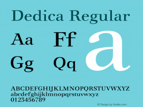
The Kairos family from Terrance Weinzierl is that rare form of typeface that successfully melds design distinction and ease of use. While based on a popular 19th century typestyle, it performs admirably in a variety of 21st century applications, both in print and on screen.
Full story : Kairos = 51 styles by Monotype

Choplin is a modern and clear geometric slab serif with a sturdy heart. It was designed based on the Campton Family, with the same principles in mind: geometry, simplicity and neutrality. As a consequence, Choplin could be seen as an immediate companion to the Campton Family. However, during the process lots of details were changed in order to sharpen the slab serif character which resulted in a slightly different interpretation.
Similar to Campton, it is perfectly suited for graphic design applications ranging from editorial, corporate, web, interaction to product design. In addition, it has an extended range of alternative glyphs, ligatures and opentype features which provide flexibility and uniqueness wherever it is placed.
Full story : Choplin = 18 styles by René Bieder

Aerotype presents this exquisite OpenType Std (TTF) script ready to dress up your most important pieces. You get these variations for a truly versitile font : Keepsake Fill, Keepsake Drop, Keepsake Open, Keepsake, Keepsake Drop Shadow
Full story : Keepsake Complete Family Pack
MORE from the world of fonts, lettering, calligraphy, and typography
 And, thanks for reading

Editor/Publisher : DTG Magazine
+FredShowker on Google+ or most social medias @Showker
Published online since 1988