
Source: http://aku.co.AKU. License: All Rights Reserved.
AKU:
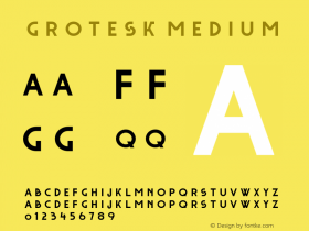
The exhibition concentrates on the later part of Estonian farm architecture (from mid-19th to mid-20th century. A revival of an early 20th century grotesk was therefor chosen as the text typeface and a modern, slightly robust serif as the headline font. The bold typography complements the minimal white structures resembling the shape of a farm house.
Exhibition design: KAMP Architects
Exhibition photos: Terje Ugandi

Source: http://aku.co.AKU. License: All Rights Reserved.

Source: http://aku.co.AKU. License: All Rights Reserved.

Source: http://aku.co.AKU. License: All Rights Reserved.

Source: http://aku.co.AKU. License: All Rights Reserved.