Source: http://www.obsidianstudio.co.Photo: Mike Heighway. Obsidian. License: All Rights Reserved.
The Slice Logo is the primary logo used for Gioco.Trio Groteskhas been stretched lengthwise slightly to allow for the 'G' to take on the morphology of a football, but still maintain consistency across the rest of the lettering.
Gioco is an upscale sports bar in Albuquerque, New Mexico. It initially started out as an identity design project, but quickly turned into a more holistic branding job, including the integration of the brand into the architectural environment.

Source: http://www.obsidianstudio.co.Photo: Mike Heighway. Obsidian. License: All Rights Reserved. Artwork by Mike Heighway.
The wordmark is the secondary identity, for use in formats where the Slice logo is not pragmatic.

Source: http://www.obsidianstudio.co.Photo: Mike Heighway. Obsidian. License: All Rights Reserved. Artwork by Mike Heighway.
The metal 'G' is backlit with RGB LEDs which can be modified to get as close as possible to PMS #1797 which is the red used for the brand.

Source: http://www.obsidianstudio.co.Photo: Mike Heighway. Obsidian. License: All Rights Reserved. Artwork by Mike Heighway.
The 9'x10' entry screen combines the referee stripes and the stand-alone 'G', which is the tertiary branding element.

Source: http://www.obsidianstudio.co.Photo: Mike Heighway. Obsidian. License: All Rights Reserved. Artwork by Mike Heighway.
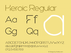
Heroicis the typeface used for all collateral.

Source: http://www.obsidianstudio.co.Photo: Mike Heighway. Obsidian. License: All Rights Reserved. Artwork by Mike Heighway.
The menu is broken into 4 parts: Pregame, 1st Half, 2nd Half and Overtime.