
Source: http://houstoniamag.com.Photo: Chris Skiles. License: All Rights Reserved. Artwork by Chris Skiles.
Houstonia magazing "50 Best Mexican Restaurants" cover.
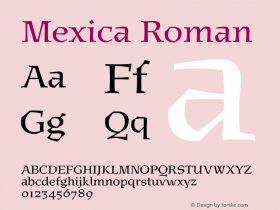
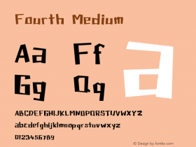
Samples from the July 2014 issue of Houstonia magazine — a city magazine out of Houston, Texas. The cover story is "Mexican Gold" about the 50 Best Mexican Restaurants in Houston. I chose the relatively new typefaceIcebox,by Cyrus Highsmith and Font Bureau, to bring a little fun into the package. The "magnetic letter" style typeface reminded me of the papel picado banners often used as decoration in the Mexican restaurants of the area. To mimick this, I used the typeface for display, mainly in a variety of colors and attached to a "string" rule, like banners. I also used Icebox in it's typical upper/lowercase style for smaller detail listings such as the "Fast Facts" sidebars — which you can see a detail of below. For the cover, the word "Mexican" was a customized version of the typeface that was integrated with a "50" inTurnipand "Plus" and "to die for" inQuiosco.
I believe this usage of Icebox was so successful that we're looking to expand the use of it in the magazine moving forward. Other typefaces used in the design of Houstonia are Font Bureau classics such as Turnip, Quiosco andSalvo Sans— evident in the images.

Source: http://houstoniamag.com.License: All Rights Reserved.
Opening spread for the cover feature.

Source: http://houstoniamag.com.License: All Rights Reserved.
Secondary feature spread.

Source: http://houstoniamag.com.License: All Rights Reserved.
Third feature spread.

Source: http://houstoniamag.com.License: All Rights Reserved.
Fourth feature spread.

Source: http://houstoniamag.com.License: All Rights Reserved.
Detail of the Icebox usage in the "Fast Facts" sidebar.