
Source: http://glyndebourne.com.Glyndebourne. License: All Rights Reserved.
Detail from the schedule for July. Tables are set in Trilogy Sans.
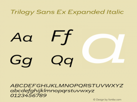
Since 2011,Enigmaas the primary font in theirTrilogy Sansis deployed as a sans serif complement to Enigma, "for subheads, captions, tables, and footnotes: whenever typographic variety will make [their] communications more readable." The logo is a tweaked version ofAspect, another typeface by Jeremy Tankard.
The images are taken from the Festival 2014 brochure.

Source: http://glyndebourne.com.Glyndebourne. License: All Rights Reserved.

Source: http://glyndebourne.com.Glyndebourne. License: All Rights Reserved.

Source: http://glyndebourne.com.Glyndebourne. License: All Rights Reserved.

Source: http://glyndebourne.com.Glyndebourne. License: All Rights Reserved.
Detail: Trilogy Sans Extrabold paired with Enigma, each with italics
Source: http://glyndebourne.com.Glyndebourne. License: All Rights Reserved.
Detail: Enigma Bold and Italic

Source: http://glyndebourne.com.Glyndebourne. License: All Rights Reserved.

Source: http://glyndebourne.com.Glyndebourne. License: All Rights Reserved.

Source: http://glyndebourne.com.Glyndebourne. License: All Rights Reserved.


