Lukas Schneider. License: All Rights Reserved.
Cover: Poke and Bend by Nadja Bournonville
Gute Aussichten. New German Photography 2013/14 is published on the occasion of the annual media and exhibition project founded in 2004 to promote young photographers in Germany.
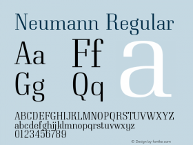
The typeface family used throughout the catalog isDamienby first official use of the yet unreleased fonts. Damien started life in the Type and Media program at the Royal Academy of Arts (KABK) in The Hague. The family spans both Text and Display styles. Its look "evolved from a personal preference for pointy shapes, high contrast and straightforwardness." Damien's striking features include a wedge-shaped 't' bar, a spiky arc for 'a', and diamond-shaped dots — latter are probably made available as an optional stylistic set. Read more about the design process on the Type and Media 2013 website. Schneider plans to release Damien later this year.
Gute Aussichten is edited by Stefan Becht and Josefine Raab and published in cooperation with Revolver. With works by the award winners Nadja Bournonville, Anna Domnick, Birte Kaufmann, Lioba Keuck, Alwin Lay, Marian Luft, Stephanie Steinkopf, Daniel Stubenvoll, Christina Werner. With texts by Dr. Wibke von Bonin, Verena Hein, Mario Lombardo, Julika Neumann, Dr. Thomas Niemeyer, Josefine Raab, Luminita Sabau, Dr. Sabine Schnakenberg, Ingo Taubhorn. An extract of the book is available as pdf.

Lukas Schneider. License: All Rights Reserved.

Lukas Schneider. License: All Rights Reserved.
For the text settings, the book designers decided to mix the upright Bold with Italics from the Regular.

Lukas Schneider. License: All Rights Reserved.

Lukas Schneider. License: All Rights Reserved.

Lukas Schneider. License: All Rights Reserved.

Lukas Schneider. License: All Rights Reserved.

Lukas Schneider. License: All Rights Reserved.