Source: http://www.subtraction.com.License: All Rights Reserved.
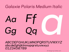
"Hopefully it's obvious that the mark is composed of three cards forming a W shape. But on a more subtle level, it's also meant to represent the promise of what we're trying to do at Wildcard: build a "third way" between today's mobile browsers, which offer great breadth but poor user experiences, and native apps, which offer rich user experiences but poor breadth and relatively cumbersome access. The middle card, the gold one, is meant to represent the Galaxie Polaris, which we've adopted as our official font family." — Khoi Vinh

Source: http://trywildcard.com.License: All Rights Reserved.