
Source: http://typeology.org.Photo: Stephen Coles. License: All Rights Reserved. Artwork by Stephen Coles.
Fonts In Use post, recommending typefaces to clients, or grouping fonts by random themes.
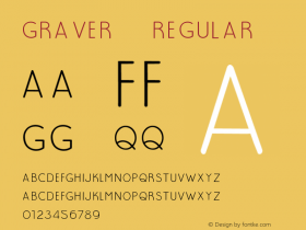
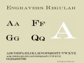
I wanted an unassuming, vaguely vintage look, so I went with a strong mid-century slab (Belizio, David Berlow's take on Egizio) and a straightforward sans based on engravers' plates of the early 1900s (Sweet Sans, Mark van Bronkhorst's vastly more usable alternative to Sackers and Engravers Gothics). The two families pair very nicely.
The rest of the design stems from my laughable HTML/CSS skills and Tumblr's limitations as much as any other considerations. But I think the thing looks how I wanted it: a whiff of antique, but not fancy or overwrought.

Source: http://typeology.org.License: All Rights Reserved.
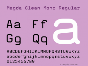
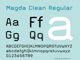
The favicon is made withFF Magda Clean Mono, based on the impression of modernist typewriters like theThe Written Word, a great font to use when you want to imply written words without actually writing something.