Source: http://creativereview.co.uk.License: All Rights Reserved.
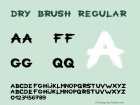
In a previous post about another British book cover from 2013, I wrote: "What looks like a custom dry brush lettering job at first glance has actually started out with type." The very same is true for this cover by David Pearson. Here, the basis was the Brush Extreme style ofB-Movie Retro.
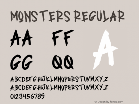
This script typeface by Die Typonauten is "a typographic homage to horror films from the 1930s and 1940s, featuring Boris Karloff, Bela Lugosi and others; films about vampires, monsters from the swamp, and creepy mummies." — Peter Reichard
For this use, the letterforms were heavily customized. Not only were they considerably condensed; the tailed 'l' was replaced with the straight 'I', 'A' got a longer crossbar, and 'F' was completely reimagined.
Animal Farm was first published in 1945 and made into an animated film a decade later.
See the first US edition here and more from Penguin's Great Orwell series on Creative Review.