Image by Ken Carbone
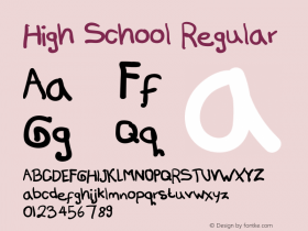
Pick a font, any font; typography is today's common currency of communication. Not everyone can draw, or take a riveting photograph but everyone works with type. It was once the sole domain of inky-fingered "type setters." Now, decades later, digital technology allows everyone, from a high school coach to a highly paid branding agency, to employ type effectively. Combine this with the increasingly easy manipulation of the zillion fonts online, and the result is the de-facto commoditization of graphic design.
Even in this DIY era, the true crafting of a great typeface remains a marvel. Type designers adoringly describe the anatomy of a letter by its "ear, waist, lobe, spine and body." With surgical precision, they slave over every exacting detail. They stress test every imaginable application to reach functional perfection.
Self described "type nerds" watching a blockbuster film seethe if a typeface used in a scene is inauthentic to the period of the story. Obsessive? A bit. And, with over one thousand books about type design currently listed on Amazon, the rapturous love affair with letters is at a climactic peak.

Designed in 1989, the typeface Trajan continues to be a favorite of Hollywood. It was used for both of these period films, but was created 77 years after the sinking of the Titanic, and 126 years after the Emancipation Proclamation depicted in the film, Lincoln.
What's all the hype about type? How is great type really measured? Has this definition changed over time? As part of this series, I asked three master type designers, each from very different backgrounds and generations, to share what they think.

Erik Spiekermann has been designing typefaces for over three decades. He is Managing Partner and Creative Director at Edenspiekermann, an international design and branding firm. In 1989, he founded FontShop, the first font reseller in digital type history and introduced his highly regarded typefaces: Meta and Officina.
His measure for great design reflects age-old principles: "It solves the problem at hand and adds beauty."

Photo Courtesy of Erik Spiekermann
A favorite example of this embodies classic German design and engineering: "My Leica cameras, they let me take beautiful pictures, and they are beautiful objects to behold and to use." Proof that great design has no expiration date, he adds: "Some have been with me for decades and have never failed me."

When Berlin re-united in 1990, Spiekermann created a bright, optimistic design for the city's transit system: "Apart from guiding people through the system of trams, subways, buses and ferries, we also wanted it to simply look cheerful and friendly." His approach to solving problems "beautifully" drove the design and reflected the excitement of the time.


Over twenty years later, he admits the system needs some refreshing, but believes: "It still works and makes taking public transportation around Berlin as pleasant as it can be." With bold, contrasting colors and the crisp, san serif typeface, FF Transit, Spiekermann shares: "Berliners are proud of the yellow-and-white vehicles, they have become as much a symbol for the city as the red double-deckers did for London."

Jonathan Hoefler, a typeface designer and type historian, who with his partner Tobias Frere-Jones at H&FJ has designed original fonts for legacy publications such as Rolling Stone, Harper's Bazaar and the New York Times Magazine.
Hoefler seeks "elegance and wit" in design, and echoes Spiekermann's sentiment, that it's about solving problems: "What distinguishes truly great design is how successfully it stands up to progress: does a design become an evolutionary dead end, or does it adapt to satisfy new technologies, and serve new kinds of readers?" This distinction carries serious practical and economic implications, especially when specifying a typeface for a brand identity that is intended to feel "current" for decades.
Our digital devices will continue to drive the way we access information, and Hoefler's company, in anticipation of that, is proactively updating their popular typefaces to meet this evolving demand: "We've spent the past few years revisiting our most successful typefaces, to completely redesign them for the screen: ensuring that 21st century readers can experience Gotham and Mercury and Sentinel not just on the page, but on mobile and desktop screens." This is a significant investment for H&FJ, but he believes: "If we're at all successful we hope we'll see these modern classics remain a vital part of designers' toolkits."


Andy Cruz is the co-founder and "creative nerve center" of House Industries. An absence of conventional design training has resulted in his unconventional approach to typeface design. With a heavy dose of the urban vernacular, House Industries' fonts Smidgen, Blaktur and House-a-Rama, for example, allow designers to let loose and just have fun.

The House-a-Rama is a suite of three distinct typefaces.
That "bit" about form and function, he reminds us, "is a given." His keen eye focuses on what interests him most and things that, "possess an enigmatic element; that magic dust that usually cannot be quantified but imparts a special feeling and often indescribable quality to a piece."

Cruz says he was born the son of a "hot rodder." So, choosing the "five spoke mag wheel" as his model of great design fluidly connects to his life experience: "Originally designed to enhance performance, the mag has the transforming ability to make whatever it is applied to look cool. Kinda like a good typeface."


From his own portfolio, Andy Cruz points to his "Alphabetic Equestrian for Maison Hermès" in Tokyo as a design that embodies his creative ideals: "The project included some of our favorite things: letterforms, animatronics, a cedar tree and a client who understood the value of that combination." Another measure of the design's success he says was, "Seeing the smiles it put on the faces that walked by makes me think we did something that went beyond form and function."

David Ogilvy and Leo Burnett
Legendary "mad men" like David Ogilvy and Leo Burnett placed a premium on "copywriting." They generally used type in a supporting role to a conceptual photograph. But, today, type as idea and image, dominates design trends. Being slightly "typo-phobic," I principally see letters as building blocks, for words used to express ideas. Preferring clarity over expression is a position that puts me squarely in the minority among "type nerds." Fortunately, the expert craft of many talented type designers today increases our ability to state both clearly, and expressively, important ideas worth communicating.
This alone is worth sweating over the dot of an " i" and the cross of a "t."
CORRECTION:This post previously described the fonts Smidgen, Blaktur, and House-A-Rama as having been designed exclusively by Andy Cruz. The post has been updated to clarify that the fonts were designed by his firm, House Industries.