One and a half year ago I reported about Scrabble Typography Limited Edition, Andrew Clifford Capener's sumptuous edition of the universally known and loved board game Scrabble. The new Scrabble Typography Edition 2 is a response to the feedback he received from loyal fans from the first edition. He created a gorgeous signed and numbered limited edition set combining the beauty of typography with classic Scrabble game play. Clearly many agree, as more than half of the edition of 2000 have already found their way to an owner. A gift idea for the upcoming holiday season?

Andrew spent months reconfiguring a game board that would be more functional for avid Scrabble players, but still was a beautiful object. The game board itself was designed to look like a solid cube floating slightly above ground. This hovering illusion is created by the stainless steel lazy susan it is mounted on, meaning the game board can effortlessly be rotated to face each player. Lifting up the playing area reveals a cork-lined interior storage space that houses a Bauhaus-inspired timer, maple tiles with non-slip bottom surface, and a stitched scorekeeper designed to be a score keeping journal. It allows the user to record the players involved with the game, their scores, and ultimately who won the game. The light maple tiles were designed to contrast with the dark walnut playing surface. The tile racks are also influenced by Bauhaus – just as with everything included in the set their design is functional and minimal.


Exclusively for The FontFeed Andrew revealed the 15 separate typefaces he hand chose to be featured on the tiles. He also confessed he is a huge FontShop fan; back in 2010 Andrew had a hand in Meet Your Type, the equally amusing and informational field guide to typography.
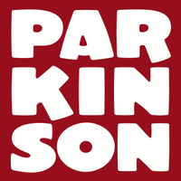
Two styles of Knox, "a hearty dimensional letter in the "Grecian" style" (see also John Downer's Ironmonger Three D)Sneaker Script, a neon-like connected scriptGill Sans Light Shadowed, a shadowed version of Eric Gill's iconic humanist sansEstilo, the minimalistic geometric sans that spawned the family which now also includes a variant with angular stroke endings, a script, and a text versionBlender, the faceted square sans reminiscent of Wim Crouwel's iconic stamp designsHoosier Daddy, an extruded chunky slab serif by Jim ParkinsonThe FontFeedTrend Slab One, an all-caps geometric slab serifKumla, a Swedish Art Deco display sansGraphique, an extruded skyline sansPrismatic by Match & KeroseneCubic, an experimental constructivist display faceHessian, a Tuscan by Matt Desmond a.k.a. MADtypePort, an experimental Didone typeface with a modern twist

Full Features on the Product Page.