Source: http://www.sltrib.com.Photos by Randall Smith as published in The Salt Lake City Tribune. License: All Rights Reserved.
The Church of Jesus Christ of Latter-Day Saints (Mormons) had no consistent, comprehensive visual identity until 1974 when Randall Smith and his team designed this logo. I'm fond of it, despite it being a sort of half-eaten typographic layer cake. Maybe it's just because I grew up with it (being a member of the church until my teens) but I also loved the old PricewaterhouseCoopers logo and that was even more ungainly.
It usesBaker Signet, a typeface designed a decade earlier by Arthur Baker for VGC. Baker is known for his vigorously calligraphic faces and while Signet certainly shows signs of a pen, it is has a calmer, more traditional classical roman air than most of his designs, especially when seen in all caps. Slight modifications were made for the logotype, such as an extension on Baker's reticent 'J'. The letters are well suited for the granite inscriptions that often label LDS meeting houses and temples.
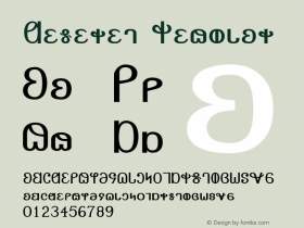
In 1995, the church decided that this design was too corporate (and maybe too chaotic), but more importantly they wanted to clarify that they are a Christian religion. They replaced the design with a more staid treatment emphasizing the words "Jesus Christ". There are slightly conflictingreports about the 1995 design, but the consensus seems to be that it was designed by Adrian Pulfer and McRay Magelby with a proprietary typeface by Jonathan Hoefler called Deseret.

Source: https://en.wikipedia.org.License: All Rights Reserved.
LDS Church logo, 1995 to present, uses proprietary type drawn by Jonathan Hoefler.