
Source: http://trufcreative.com.License: All Rights Reserved.
"After years of designing better brands for everyone else, we felt it was time to better our own. Moving away from the textured, Russian Constructivist-look and more towards the Swiss, we distilled our identity down to its purest form: der Umlaut. Circles, dots and the Ü motif reconfigure into interlocking and repeat patterns creating a set of unique business and greeting card designs. Electric bolts echo the magnetic philosophy behind our Brand Attraction process. The full system reflects our flexible design aesthetic. We partnered with JMX2 to build a site that's responsive, making it a true fit for any size screen." — TRÜF
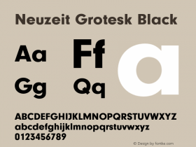
The logo appears match the umlaut fromInterstateCondensed Black. All other type isNeuzeit Grotesk.

Source: http://trufcreative.com.License: All Rights Reserved.

Source: http://trufcreative.com.License: All Rights Reserved.

Source: http://trufcreative.com.License: All Rights Reserved.

Source: http://trufcreative.com.License: All Rights Reserved.

Source: http://trufcreative.com.License: All Rights Reserved.

Source: http://trufcreative.com.License: All Rights Reserved.

Source: http://trufcreative.com.License: All Rights Reserved.

Source: http://trufcreative.com.License: All Rights Reserved.

Source: http://trufcreative.com.License: All Rights Reserved.

Source: http://trufcreative.com.License: All Rights Reserved.

Source: http://trufcreative.com.License: All Rights Reserved.

Source: http://trufcreative.com.License: All Rights Reserved.

Source: http://trufcreative.com.License: All Rights Reserved.