It's serendipitous that Jurriaan Schrofer, Restless Typographer is the next Unit Editions book I review after Type Only, their overview of contemporary typographic artwork (keep checking their Tumblr for more 'type only' work). The monograph celebrating the experimental typography of Dutch graphic designer Jurriaan Schrofer published this past Spring nicely puts Type Only in context. Schrofer worked for the renowned design studio Total Design (rebranded Total Identity in 2000) and was an outspoken figure within Dutch professional design organisations. Most of all he was an experimentalist in letter forms and typography. He was a pioneer in corporate identity; a designer of photo books; and art director of the architectural magazine Forum.

Instead of starting with the book's content and concluding with the form, the shape and binding and overall concept of Jurriaan Schrofer: Restless Typographer forces me to discuss all aspects simultaneously. This is a good thing. It shows how much thought and care Unit Editions put into this publication as a physical object; how content informs form and form guides content. The binding is superb: the sturdy front and back cover have a matte, textured finish – a bit like weaved fabric – and the open spine reveals Schrofers last name set in one of his minimalist geometric typefaces, printed in simple black on the white spines of the sections sewn with black thread. Because of the open spine the spreads fully open which is an advantage for a book of modest dimensions (150 × 250 mm / 5.9" × 9.8").

The book is divided in colour-coded sections that use an extra Pantone spot colour to great effect. Instead of starting with the obligatory introduction or biography, it delves straight into the heart of the matter. The opening section shows Schrofer's own type designs, reproduced on ten fluorescent salmon pages (the picture above doesn't do interviewed for The FontFeed in Summer and Fall 2009.


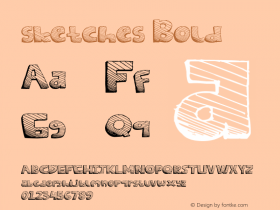
From there on the book logically progresses to the next section comprising of sketches, studies and finished work drawings, reproduced on white pages. This is the part that really blew me away. It is amazing to see how accurate his initial sketches are, and how – despite the geometric nature of most of them – his work drawings live and breathe. Schrofer's approach to letter shapes is very inventive; playful yet methodical. He often skirts the edges of readability yet manages to keep his designs legible and intelligible, and most of all surprising. Many of his typographic treatments brilliantly incorporate aspects of op art and the intricate puzzles of his compatriot M.C. Escher. Repetitive, almost hypnotic patterns alternate with astonishingly fluid compositions. At times he seems a Wim Crouwel on acid. Or magic mushrooms. It's just pages and pages of pure typographic bliss.


The bulk of the book are the printed works, reproduced on black pages. This allows the reader to compare the sketches and original drawings from the previous section with the finished products, together with other graphic design work. Again Schrofer's work is so imaginative that much contemporary typographic art looks complacent and self-important, and pales in comparison with his daring experiments.


The book concludes with an enlightening biography by his biographer, design writer Frederike Huygen who describes his work as
'research into perception, visual effects and the optical illusion of perspective: or the interplay of letter form, pattern and meaning.' She also refers to him as a 'computer-designer before the computer'.

Even though he has his own chapter in when thumbing the pages of Type Only was immediately present when discovering page after page of gorgeous, daring typographic art.
Beautifully designed by Tony Brook and Elena Carl from Spin, the book's lay-out channels the Dutch pragmatism with a playful twist. I love how the page numbers, dates and captions are integrated into the pages and interact with the reproductions. The book is set in Fugue, a Futura-like geometric sans "conceived as an appreciation of and going-back-to-the-future-and-back-again with Paul Renner." Jurriaan Schrofer, Restless Typographer is compact, well thought-out and cleverly structured; a brisk read that warrants revisiting over and over again. Its modest price makes it an indispensable book for lovers of letters and art, and how they connect.