Doing some research for the opening sequence of True Blood, one of the most watched dramatic series in HBO's history, I landed on The Art of The Title Sequence, my main resource for motion typography in movies and television. And as usual I couldn't resist watching the end credit titles for Lemony Snicket's A Series Of Unfortunate Events. It reminds me of a story my grand-father told me when we were visiting Firenze after I just graduated, about a flamboyant American tourist he'd met who simply had to go admire Michelangelo's David every single time he visited the city. "Just a glimpse of David!"
Without a doubt one of the most beautiful title sequences ever, the intricate and sophisticated piece is a perfect marriage of art direction and design, motion graphics, music and typography. Art directed by James Caliri, the Grammy-nominated music video director, it is dark, yet playful, somewhere between illustration, paper cut-outs, and collage, with strong references to the Indonesian Wayang shadow puppet theatre. Caliri states: "I never let go of my ultimate goal. I wanted to make an enchanting, inviting piece that not only held true to the sentiment of the Lemony Snicket books, but also paid tribute to the amazing talent listed in the end credits," yet strangely enough the team responsible for this fascinating gem isn't even mentioned by name in those credits.
Lemony Snicket's End Titles from Jamie Caliri on Vimeo.
| Produced by | AXIOM DESIGN & MWP / CALIRI PRODUCTIONS |
| Producers | Mike Miller |
| Gary Levine | |
| Creative Director | Brent Watts |
| Director / Designer | Jamie Caliri |
| Character Designers | Joe Esquibel |
| Justin Reynolds | |
| Layout Artists / Lead Animators | Todd Hemker |
| Benjamin Goldman | |
| Animators | Chris Meyer |
| Joel Fox | |
| Illustrators | Joe Esquibel |
| Tom Arron | |
| Typography / Text Layout | Scott Sorenson |
| Matt Manes | |
| Backgrounds Artists | Celeste Rockwood-Jones |
| Roger Loveless | |
| Production Coordinator | Mimi Vigh |
| Production Manager | Renee Cannon |
| Technical Producer | Benjamin Goldman |
| Film Out | E-Film |
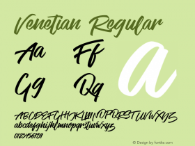
For some reason I suddenly realised I had never paid any closer attention to the typography by Scott Sorenson and Matt Manes. When I first watched the movie with my kids I remember being blown away by the title sequence. I noticed the titles looked very sophisticated and expertly set, but as the type was quite small on the screen I couldn't make out what typeface had been used. So this time I looked more carefully, and recognised Vendetta, John Downer's contemporary interpretation of the Venetian model, with H&FJ's ubiquitous Gotham as a secondary face. A nice detail is that Sorenson and Manes custom set roman caps with italic lowercase for an authentic look in the tradition of the very first Venetian italic faces. Director Jamie Caliri talks in depth about the process of creating the animated sequence on Forget The Film, Watch The Titles.
Vendetta is a peculiar design. The overall impression is surprisingly elegant when you see how brutally geometric the structure of the characters is. Those "rough" shapes remind of the Dwiggins design principle, where over-emphasis and exaggeration of the features helps achieve a crisper type image. Here is a very insightful article by John Downer explaining the rationale behind his creation. See also Tiffany Wardle's dissertation The Experimental Type Designs of William Addison Dwiggins.
I'd like to use this post to introduce a cool new toy FontShop incorporated in The FontFeed. Frederik Berlaen built a neat application which lets us create FontTesters (not an official name, I just made that up). Whereas the sample settings on most foundry and vendor websites are limited to a single line in a single font, these font testers give the opportunity to set sample text in different weights, styles, and sizes. Have fun; I hope you like it.