Source: http://www.newseum.org.License: All Rights Reserved.
The image above is from today's Wall Street Journal. Font Bureau has more about the 2007 redesign:
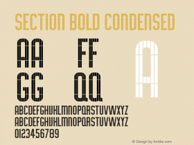
When careful use of color first appeared on the front page of The Wall Street Journal, it was also graced with Cyrus Highsmith'sEscrow, a new series of Scotch that referenced Monotype's 1908 Scotch No. 36.
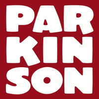
Escrow was drawn for headlines and Escrow Text for captions, with small caps for section heads. Jim Parkinson was commissioned to customize the nameplate.
Sharpening overall appearance within Journal tradition is the work of Design Director Joe Dizney and design consultant Mario Garcia. They recognized that the distinctive headline typography drove the look of the paper.
'Escrow is the spectacular singular element that holds the whole thing together,' says Dizney, and provides the required hierarchy and subtlety within the disciplined palette of The Wall Street Journal. It is businesslike and glowing with austere life."

Source: http://www.fontbureau.com.License: All Rights Reserved.

Source: http://www.fontbureau.com.License: All Rights Reserved.

Source: http://www.fontbureau.com.License: All Rights Reserved.

Source: http://www.fontbureau.com.License: All Rights Reserved.

Source: http://www.fontbureau.com.License: All Rights Reserved.

License: All Rights Reserved.

License: All Rights Reserved.