Source: http://www.typecamp.org.License: All Rights Reserved.
Posted as part of a little survey about websites for conferences on typography and graphic design – how do these specialist events present themselves typographically, in 2013?
this overview, since it is also about coming together, in order to hear and learn about typography. And yes, Type Camp is awesome. At least that is what the enthused participants of the Bauhaus Camp 2012 assured me.
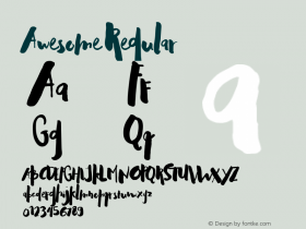
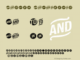
For the website: What is there not to love? Three gorgeous type families, including the exclusive Don. A useful adaptive layout. Lots of vermilion. And a Castor canadensis! That even outweighs the straight apostrophe on the homepage.
Webfonts: ✓ (c. 9 styles, self-hosted and via Fontdeck)
Designer credits: (✓)
Typeface credits: ✓

Source: http://www.typecamp.org.License: All Rights Reserved.