
Source: http://www.atypi.org.License: All Rights Reserved.
Posted as part of a little survey about websites for conferences on typography and graphic design – how do these specialist events present themselves typographically, in 2013?
This year's TypeCon, there is not much too see on the website yet. All conference-related information is embedded in the general ATypI website, which saw a design overhaul a while ago. The lobster-red bars seem to cite modernist typography. Veteran Rockwell is paired with the web-optimized Benton Sans RE. Very clear, very sober.
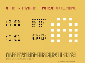
Webfonts: ✓ (4 styles via Webtype)
Designer credits: ✗
Typeface credits: ✗

Source: http://www.atypi.org.License: All Rights Reserved.

Source: http://www.atypi.org.License: All Rights Reserved.


