
Source: http://www.istype.com.License: All Rights Reserved.
Posted as part of a little survey about websites for conferences on typography and graphic design – how do these specialist events present themselves typographically, in 2013?
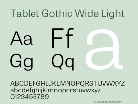
This is one of my favorites. The ISType website uses Athelas in various styles, sizes and shades; paired with some Neue Helvetica for buttons and the schedule. Light text on a dark background is always a bit tricky on the web. With the gracile shapes of Athelas used big, it works for me here. Mixing the upright with Italics and showing off oldstyle figures sets a typographic tone. The classic black-and-(orange-)red color scheme helps, too. There are nice details like a custom-colored map, or subtle effects on hover and select. The scribbled uppercase 'S' for the 2013 identity was inspired by Tablet Gothic Wide ExtraBold.
Webfonts: ✓ (4 styles, self-hosted)
Designer credits: ✓
Typeface credits: ✓

Source: http://www.istype.com.License: All Rights Reserved.

Source: http://www.istype.com.License: All Rights Reserved.

Source: http://www.istype.com.License: All Rights Reserved.


