There is one typeface missing in the many overviews of 2008 that still deserves to be mentioned. Jim Rimmer's RTF Stern already popped up on Typographer.org when it appeared on the market, and it has been written about elsewhere as well. Yet as is often the case with releases that are slightly out of the ordinary – in this case the first typeface to be simultaneously released in metal and digital – little attention goes to the actual design of the typeface. This is why I decided to take a look at this (literally) singular release in this month's Bald Condensed review. Yet I was also interested in hearing Jim Rimmer's thoughts on it as well, so I interviewed him for The FontFeed.

In an age of multi-functional digital super-families, it seems like a bold statement to release one single typeface designed for a specific purpose, and even optimised for a specific size.
It is odd to offer a single font in this age, particularly at a time when digital faces are made in a great range of weights and permutations. However making a metal type in a single style was not an uncommon practice when the great foundries of the world were busy.
Stern and Stern Metal came about because P22 wished to do a co-operative release of an original type from something that I had planned as a metal face, but had never got around to cutting. Richard Kegler's idea was to offer a tandem release: digital and as nearly similar as possible in foundry type. Rather than digging through my sketches to find a starting point I designed Stern from a fresh start. I had been wondering what I could do to honour the life and talent of the great American private press printer, Christopher Stern. The Stern type is what came out of the idea.
I have to confess that I thought probably more about the type being impressed into the paper, but I was also conscious of how it would appear in uses like lithography and digital printing, and as a result I kept in mind that the thins could burn out in those uses, where in letterpress the opposite problem of ink gain is there. I haven't used the metal type much in my own letterpress printing, except for a project I completed early December: a Fortieth Anniversary broadside for a large litho house. I was pleased to see that the digital (Indigo press) companion piece the printer produced made good use of Stern. Although inarguably light, the Stern type worked very well on their part of the project.
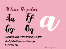
So I guess what I am trying to say is that the type can have a use as a single face. This is what I was planning all the way through the three months it took to make the fonts for both technologies: a type that could be useful without a lot of variants, but one that could be made to work by the use of a range of point sizes. The fact that the lowercase is a slightly angled Italic and the caps are flat-out Roman gives a little range. Although I did only one font in metal, the digital has been expanded to carry four sizes of Caps, and hanging and lining figures. My original intent for the metal font was to offer true x-height small caps only, in the manner of the early Aldine Italic. This however, was just too quirky, so for the digital type a mid (default) size set of caps was chosen, along with hanging and lining figures. This, hopefully has made the face more flexible for non-letterpress use.

In what way did the intended technology – metal and digital – influence the design of Stern?
I confess that I put the emphasis on the metal font in the early stages, and for that reason I made the face a very light one. I wanted it to print sharply, (letterpress) with slight rather than heavy inking. My feeling was that if I kept it on the slim side it would print incisively and cleanly.
Keeping in mind that the whole idea was that the type work well in both technologies, I made the weight substantial enough that it would bear up to litho and digital printing. So far I have seen it produced on an Indigo system in sizes down to 9 point. It prints, albeit lightly, in that small size. The text of the piece that I am describing was done in 14 point. At that size there is no problem with Stern's slim weight.
I wanted to see first-hand if there was an argument that a type that was made for digital use will not work in printing with polymer plates. I don't suggest that all digital faces will necessarily will print well in both letterpress and digital situations. However, I made no compensations in the Ikarus outlines for the two uses. I dumped the hand-digitised outlines into Fontographer and shipped them to Richard Kegler. I then printed out the original Ikarus outlines at a large size onto bristol board, which were hand-cut to make a master pattern of each.

To sum up – I have no problems with the few letterpress experiments I have put Metal Stern through, and the face works well in litho. I can't honestly say how well the the type will fare when made into polymer plates, but my knowledge of the type and the results that I have had with printing it on the Colts Armory leads me to believe it would be successful done in PP printing with a little opening up of the fit.
It's necessary that this type when letterpressed be conservatively inked. It has long been my habit to start out printing with a very stingy lay of ink on the press, and then sneak up on it, cautiously adding ink for the sharpest results. Even after careful and fussy handling of the type (in letterpress) there is a definite difference between what comes of my press and what comes out of a litho shop. The two basic reasons are that one is letterpress and the other is the finest lithographic technology. The other inescapable difference is that Metal Stern was more loosely fitted. If the Stern digital font were used with its current tight fit to make polymer plates, the result would be a third, and quite different one.

As you put the emphasis on the metal font in the early stages, did this influence the design actual letter forms? Are there restrictions, certain curves or shapes that don't work in metal?
No, the fact that I was thinking of a metal type didn't make any difference in form for the two technologies. There is nothing that you cannot do in metal as far as curves or other shapes. Letters that are super-detailed (things like Magnificat) are harder to cut because there is a lot more "road" to travel with the stylus, and one has to hope that once cutting has begun the cutter tip won't break off.
The one thing that must be handled with forethought is the weight of line relative to the scale to which the pantograph is set. The follower or stylus must be able to enter the tightest passages in a working pattern, and so this is plotted out ahead of time before any cutting is started.

I heard from Richard that you were expecting two metal sales, he himself reckoned you would sell a dozen, but it turns out Stern metal already sold 50 (!) times. What are your thoughts?
I was amazed at the interest in Stern, both digital and especially metal. I think I anticipated about a half dozen sales, since when I have done things in the past, and got the word out locally, I would sell a few fonts. At one point while I was casting a run of 20 fonts of Stern I was afraid that my supply of hard type metal might run out. I found it necessary at one point to dump some cases of things that I had cast years before and found little use for.

All photos:Anna Prior Photography
Making Faces: Jim Rimmer
The making of this typeface is also being made into a documentary shot in
HD video. A trailer can be seen here.