I'd really like to keep the movie poster reviews approximately monthly. The Robothon conference and the ensuing reports have kept me distracted at the beginning of the month, and lo and behold – March is almost over! So it is high time to get the February episode online. Here are last month's movie posters.

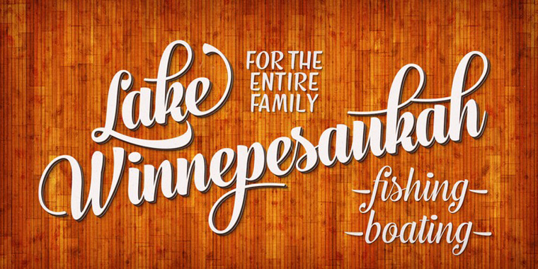
The movie poster for Push is not that exceptional, but I just wanted to point out that melting Helvetica which was used for the movie title. Being a child of the nineties, this kind of grungy stuff still exerts an undefined appeal on me. The Canadian foundry 2Rebels was – together with Garage Fonts and T-26 – on top of their game back then. Some of their rips of Helvetica are quite fun, like Angry, Boggle, Manomessa, Scritto Politto Freako, ThinMan, 2Rebels Un, as is the destroyed Univers Condensed K.O. Dirty.

On paper Henry Selick – the director of The Nightmare Before Christmas – and author Neil Gaiman are a match made in heaven. Judging from the trailer and promotional images Coraline looks stunning. The movie poster is equally beautiful, a striking clair obscur with hand written text, with a movie logo set in P22 DaVinci Forward (thanks, Ginta). Even more impressive though are the 26 (!) wonderful character posters, one for each letter of the alphabet, each featuring a two-sentence poem.


You can check the rest of the series on the Internet Movie Poster Awards website.

I so don't want to like the poster for Confessions of A Shopaholic, yet I can't help but find this both quite clever and well-executed. Bodoni conveys exactly the right upscale fashion boutique atmosphere, just like Didot would have, although for once I wouldn't have minded a less predictable choice from the Didones category, like FF Holmen, or Filosofia, or Andrade, or Ambroise, or FF Danubia for example.

The poster for The International proves that photographic composition can make or break a design. Here the architectural surroundings are used to powerful effect, the curves providing a graphic structure in which protagonists and type were judiciously positioned. It's not all good though. The obligatory Bank Gothic is well set, particularly the position and spacing of the "The" in relation to "International", but I regret that they digitally slanted it, supposedly for dramatic effect. And Clive Owens and Naomi Watts clearly look like they were pasted into the poster.

Researching last month's posters made me discover the Allcity website. I really like how they show what they call "The Designer's Cut" for each poster: examples of concepts that were not chosen. And in some cases I prefer their design over the official poster. For example the poster for Two Lovers is well-designed, a classy, slightly darker monochrome take on the typical romantic comedy poster I have scorned in the past. I especially like the tasteful typography: the actors' names in two different weights of the ubiquitous* Gotham, which is partnered with Garamond Premier for the movie title.
(*) You think Gotham is overused? Why don't you take a look at Proxima Nova.

Yet what Allcity did with the same (photographic) material is far more interesting. By fragmenting the two pictures they created some sort of photographic gradient between the two, and this results in a design that is both beautiful and conceptually sound (it's just a shame that you notice quite well the left picture with Gwyneth Paltrow is a Photoshop composite). Plus they managed to make that old tired VAG Rounded look really cool. Good show.

Gomorrah has a smorgasbord of different localised posters – the Movie Poster Database lists 16 designs with a total of 29 variants. What seems to be the original Italian poster is a stark, purely typographical design – the movie title in bright pink Compacta on a black background. All City's design – the main poster on the Internet Movie Poster Awards website – is a nice example of a checkerboard design where the many picture fragments set the tone of the movie and give a hint at the story. The silhouette of the man brandishing a gun next to the movie title is a nice touch, yet I don't understand why they switched to Franklin Gothic. The original Compacta seems more appropriate for this type of lay-out.

A trend I seem to notice is that amongst the variant posters the more subtle designs are more successful and often more frightening. For instance in the two variants above the worn and weathered movie title (Anyone know what the typeface is? It looks familiar.) and Banque Gothique also add to the overall mood.

The same applies to the two variants shown here. One would expect the explicit bloodshed in the German poster on the left to be more gruesome, but personally I find the implied wanton violence in the French variant on the right far more disturbing.

Can someone please explain this to me? The teaser poster (left) for Madea Goes To Jail is wildly different from the eventual movie poster (right), not only design-wise but most of all because they suggest two completely different genres of movies. The final poster fits perfectly Tyler Perry's hysteria comedy. It is a decent design, nothing wrong with it. Yet judging from the teaser poster one might think the movie is some sort of emotional drama, as the design is classy and sophisticated, with all type set in tastefully spaced Trajan. The beautiful combined image of Madea's portrait captured in the silhouette of the dove with its wings turning into smoke has a dark and brooding quality to it, which makes this poster totally inappropriate for this type of movie.
Yeah, yeah, I get it, I didn't get it. Call me stoopid.

A rather juvenile poster for Fired Up – yeah, we all know what these two giganamous capitals stand for, har har… I don't want to sound like a cranky ol' bastich – I do appreciate a healthy dose of double-entendre – but isn't this a tad too obvious?
As we often received research requests for this type of college/sports typefaces on the TypophileStephen created the Collegiate Athletics FontList, a collection of "(…) sans and slab typefaces emulating the letters that traditionally appear on college and vintage sports team logos, jerseys, and letterman jackets." Very handy. The slab serif is the classic Memphis.

I'm pretty sure Helvetica is used next to ITC Avant Garde Gothic. You have to be one kick-ass typographer to make that combination work.

Is there a nicer way to say "commercial drivel"? As a non-native speaker I'm a bit at a loss for words here. Any suggestions?
As for the movie title, we have added a Dots on a Grid FontList, a list of typefaces with letterforms made from circular dots on a matrix/grid. For dotted fonts that are not mapped to a grid, see Dotted. See also Squares on a Grid and LCD, LED, Scoreboards & Other Electronic Displays.

I must say I quite like the movie poster for Crossing Over. Agreed, the top part with the cast looks a bit like a dodgy Photoshop hack, but the bottom two thirds do a very good job at translating the theme of the movie into a strong graphic image. The meandering highway lanes in red and white entering the city on the primarily blue photograph symbolise the American stars and stripes. Those lanes can be seen as metaphors for the difficult and risky journey the illegal immigrants make in their effort to enter the promised land.
The movie title is set in custom weathered Neue Helvetica Extended, with regular Helvetica elsewhere on the poster. I really don't understand the decision to use a German – European – grotesque where a typical American gothic like Franklin Gothic would have done an equally fine job. Then again, I don't think there was much of a "decision" at play here – it looks like they just went with the default. Next time they could maybe try to make a deliberate choice?

As far as action movies go the poster for Echelon Conspiracy puts a nice twist on the traditional ensemble cast type of design. The portraits of the principal actors in monochrome blue are featured on giant video walls at both sides of the poster. Those video walls form a very effective perspective that frames the silhouette of a man running. Both the reflection of the blue in the floor and the contrast with the black and white image add extra depth. The result is surprisingly dynamic for such a symmetric image.
Both movie logo and tagline are set in Agency Wide. It is a digitisation of ATF Agency Gothic, a single all caps titling face designed by Morris Fuller Benton in 1932. David Berlow's interpretation of the classic square sans to which he added a lowercase originally was a rather modest family in a single width and five weights. Since then it has been expanded into a super family in five widths and five weights.