For over four decades, Rod McDonald has held an impressive and multifaceted presence in the field of visual communication – graphic designer, type designer, writer and teacher, McDonald's work has evolved from sign painting to photo lettering and into the arena of digital type design.
One of McDonald's most recent designs debuted in September of this year. The Classic Grotesque family is a major release from Monotype Imaging; available in 14 styles, this sans serif is rooted in the historic letterforms of some of the first of grotesque designs, yet the Classic Grotesque family stands firm with its unique contemporary spirit and robust versatility. Rod recently shared with us some insight into his practice:

Personal design luminary
Living designers it would have to be Matthew Carter, followed closely by a long list of designers going way back.
Favorite era of design history
All of them. Each for a different reason.
Learned to design type
Like so many others in this business I'm largely self taught.
Design mentors
Canadian design pioneer John Gibson was my mentor, sadly he died last year.
Favorite text on typography or design
I can't narrow it down to one or two books.
Longest a typeface has taken to design
Four years, that was Classic Grotesque. Although I didn't work on it full time and there were long interruptions.

Shortest time to design a typeface
A few weeks.
Favorite typographic resource
I need a reason to design a typeface, then I find the resources.

Habitually challenging glyphs to design
Don't ask me that, I'm one of those guys who can agonize over a sans serif cap I!
Typefaces folks might know you for
Egyptian Slate, Slate, Laurentian and Gibson are probably my best know faces
Favorite type classification to design
I like working on text faces. They remain a challenge to me.
Percent of type design that's art vs. percent that's science
That's a sliding scale and it can vary greatly with each typeface.
Common personality of your typefaces
They are all workhorse faces.
Aspiring type designers should possess
A mind-numbing attention to detail, and patience, patience, patience.

What typeface classifications should they study?
All of them.
Favorite of your typefaces in use
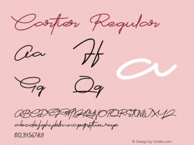
Ten years later Maclean's magazine are still using Laurentian and that's after a few redesigns. Cartier Book is used on all the historic plaques in Canada.
Favorite medium to see your typefaces
It's still print, but that's changing rapidly.
Most egregious typographic error in common practice today
That type is only about the art.

Ryan Arruda is the Web Content Strategist at Monotype Imaging. Ryan holds a bachelor's degree in film studies from Clark University, and an MFA in graphic design from RISD.