
Source: http://www.flavorwire.com.License: All Rights Reserved.
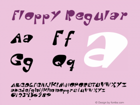
"Prior to the first Macintosh, alongside the apple symbol, Apple used a typeface calledMotter Tektura, which was designed in Austria by Othmar Motter of Vorarlberger Graphik in 1975 and distributed by Letraset — and also famously used by Reebok. At the time, the typeface was considered new and modern. One modification to the typeface was the removal of the dot over the 'i'. The lowercase 's' was also modified for the label on the Disk II 5.25-inch floppy disk drive.
According to the logo designer, Rob Janoff, the typeface was selected for its playful qualities and techno look, which were in line with Apple's mission statement of making high technology accessible to anyone. Janoff designed the logo in 1976 while working with Palo Alto marketer Regis McKenna. The Apple logo's bite mark was originally designed to fit snugly with the Motter Tektura 'a'." — Wikipedia

Source: http://en.wikipedia.org.Uploaded by IMeowbot to Wikipedia in 2006. License: CC BY.
From 1977–84 the Apple logo was set in a modified Motter Tektura. This image is a recreation by a Wikipedia user.