
Source: https://www.thisispersonal.org.License: All Rights Reserved.
This Is Personal is a campaign from the Woman's National Law Center to "empower, educate, and activate women across the country to protect women's reproductive health care". The website is packed with information and calls to action, and the grid of cropped content turns up the volume. Despite the surface chaos, everything is quite sensibly organized with a limited color palette, helpful rollovers, clear hierachies, and (despite some common oversights like improper apostrophes) fairly readable text. And there is an alternative list view for those who just can't take the busygrid.
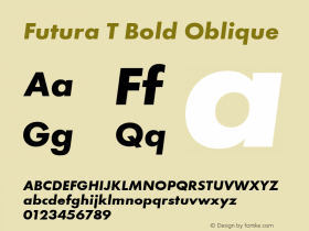
A tightly spaced, extra bold Futura (in this case, Paratype's Futuris) gives a sense of urgency to the headlines. Text is set in the casual but respectable Rooney. The logo uses Whitney.

Source: https://www.thisispersonal.org.License: All Rights Reserved.

Source: https://www.thisispersonal.org.License: All Rights Reserved.
Too bad about that "2013". It may not be an easy task, but the detail-oriented typographer would seek out a web version of Futura that offers proportional figures — especially for a project in which years often appear.

Source: https://www.thisispersonal.org.License: All Rights Reserved.

Source: https://www.thisispersonal.org.License: All Rights Reserved.

Source: https://www.thisispersonal.org.License: All Rights Reserved.

Source: https://www.thisispersonal.org.License: All Rights Reserved.
Shareable "infographics" have become a popular way to spread a viral campaign. TIP's graphics are professionally designed, which gives them more credibility than most. In this case, though, the typesetter chose a text size that is far too large for its linespacing, resulting in a slow read.

Source: https://www.thisispersonal.org.License: All Rights Reserved.
