Source: http://www.davidbuesser.com.David Büsser. License: All Rights Reserved.
New corporate design for a Switzerland based architecture studio. The idea of the design concept is based on the handling of space and proportions. The visual identity includes two characteristic design elements: the multiplication sign and the four terms. The plus sign in the former name Feusi + Peyer becomes the multiplication sign in Feusi Peyer Hubatka Architektur. The four terms define the frame of the format in different applications. The monogram finally reduces the basic idea of the visual identity in one sign.
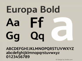
While the printed matter is set in Europa (Fabian Leuenberger, 2011), the website uses Canada Type's Gibson.

Source: http://www.davidbuesser.com.David Büsser. License: All Rights Reserved.

Source: http://www.davidbuesser.com.David Büsser. License: All Rights Reserved.

Source: http://www.davidbuesser.com.David Büsser. License: All Rights Reserved.

Source: http://www.davidbuesser.com.David Büsser. License: All Rights Reserved.

Source: http://www.fpharch.ch.David Büsser. License: All Rights Reserved.